

Reimagining learning IBM products and services
Live link to project: ibm.com/services/learning/
Roles: Research, Visual|Read time: 3 mins

IBM approached us with a goal to parse all the training for their large and diverse portfolio of products and services into one new hub. Our goal was to make the experience easier for the user to be able to quickly and efficiently register for a course, gain knowledge on a specific subject, and acquire new skills online and onsite for their job roles.
We started by conducting discovery sessions with two main types of users: IBMers who were trying to master their skill sets and clients who had previously purchased a product and needed to go through the training process. With the data from the interviews, we confirmed that the current experience was confusing, uninspiring, and outdated.
We began brainstorming opportunities for improvement and started looking into areas where we could introduce new aspects.
In the previous design, users would see a page with exposed filters, no guidance, and no context of the value proposition. Given the importance of what the site was set out to accomplish, we needed to break away from a simple search site, to something completely new and refreshing.
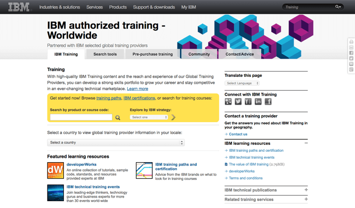
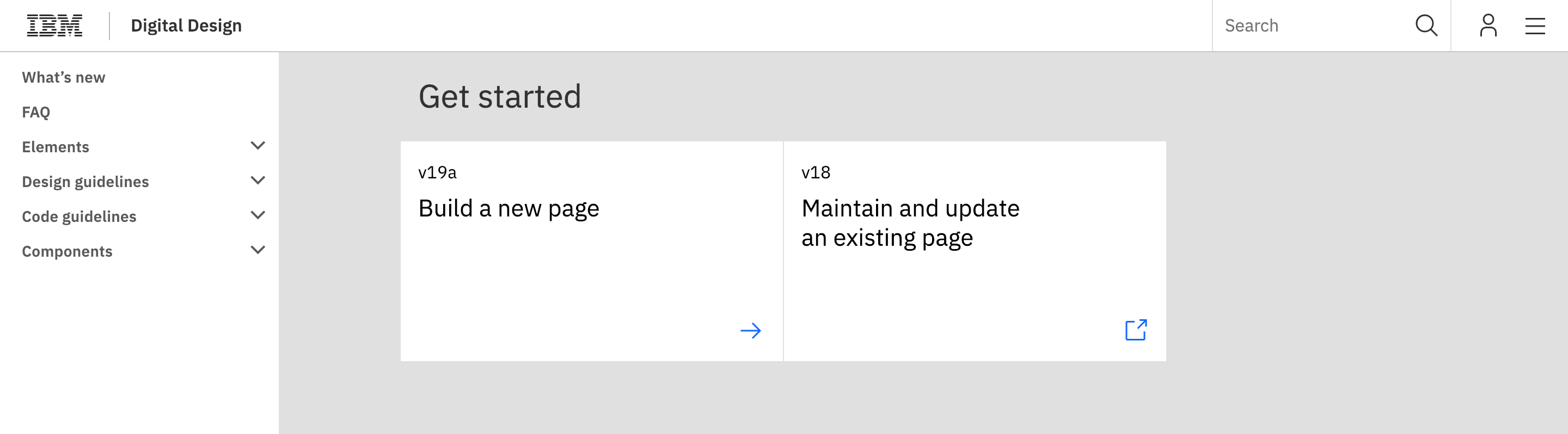
IBM has a huge problem when it comes to redesign due to their massive catalogue of content. Implementation is not easy when you are dealing with updating thousands of pages. Thus IBM "standards" was created. They are similar to style guides, but lack a key component of a successful style guide and that's the ability to be a living breathing resource. A huge side goal was to work with a team that could update the existing style guide to fit the experience the users needed.
The iconography need to display other types of information, such as categories and education types, which did not exist in their previous icon set. So visually we needed to be flexible as well.
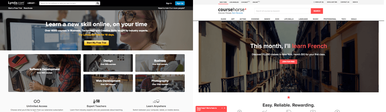
Finally we needed to be both online and in-person classroom curators. Generally, there are only two types of learning websites. One, where users enroll in in-person classes (e.g. Coursera), or the other, where users practice self-paced online learning (e.g. Lynda). Rarely are these two types of learning websites mixed into one experience. In fact, during our competitive analysis research, with the exception of university websites, we could not find any websites that accommodated both kinds of learning.
Learning a new product can be simple when given the tools to succeed. With this in mind, we began approaching the redesign.
We created a beautiful, more streamlined learning experience by introducing new key features such as:
The designed used a mix of visceral colors, playful icon sets, and lightness to make learning more engaging.
When it debuted in June of 2016, users both locally and globally were ecstatic with the results. The people who manage the “IBM.com” homepage reached out to the team to feature us under the “Service Tab” section, as a new initiative to promote the learning of their products and services. With one click from IBM.com, you are able to access training.
With a new revitalized digital learning environment, we empowered IBMers and their customers to continue to thrive and grow when acquiring new skills.