Improving ad formats for messaging ads across Meta
One of Meta's highest-value ad products was losing users at the tap. I led the cross platform effort to fix it, turning a major drop off point into a growth driver.
Scope
Facebook • Instagram Feed and Stories
Impact
+$150K daily revenue • Drove 6.5× half-year target • Aligned with 5 teams
Overview
Millions of people were tapping on a relatively new Meta ad product, and then dropping off. Not because they weren't interested, but because they didn't understand what would happen next.
"The CTA confuses me. Maybe a new window pops up? It's to message them, so it takes me to their page, to their website."
- Brazil participant in usability study
I led the redesign of messaging ad formats across Facebook and Instagram to fix this moment, unlocking revenue at scale while establishing a new design pattern for destination clarity across Meta's ad surface.
My Role
I stepped in as design lead across Facebook and Instagram to align five teams around a single question:
“How do we make the outcome of an ad obvious before the tap?”
Strategy
Unified fragmented research and prior experiments into a shared problem definition and evaluation framework
Alignment
Led cross team alignment across surfaces, orgs, and senior leadership, including Adam Mosseri for Instagram changes
Execution
Drove the design from explorations through shipped solutions across Facebook Feed, Stories, and Instagram Feed
Expansion
Identified and drove new opportunities beyond original scope, Facebook Stories was the 3rd highest ad impression surface and wasn't included
The Problem
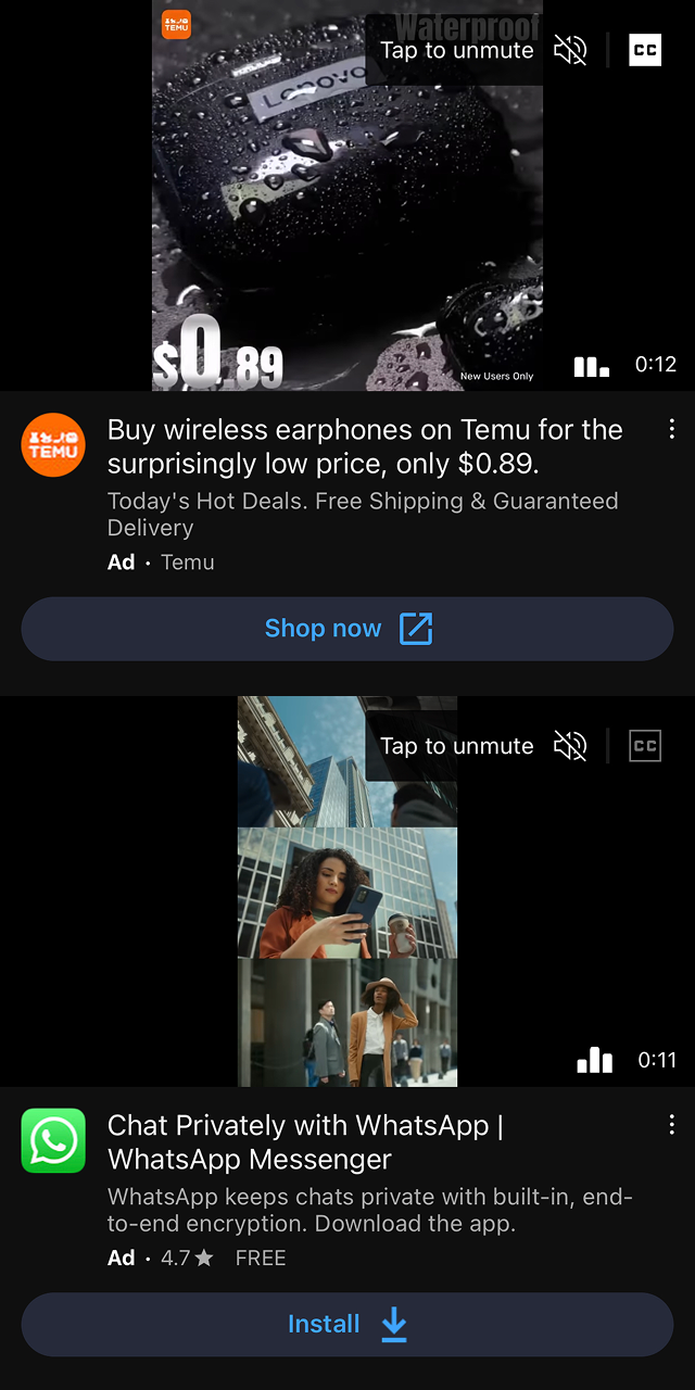
Users successfully clicked ads but failed to transition from click to conversation start. The CTA gave no signal about what would happen next, users couldn't tell if they'd land on a website, an app, or a chat.
Up to 90% drop-off in developed markets after click
60–70% drop-off in Brazil and India
This wasn't a UI problem, it was a mental model problem at scale. Three compounding factors made it hard to solve:
Trained behavior
Users had been trained for years that ads lead to websites
Global surface
The solution had to work across Feed, Stories, and future formats in every market
Identity confusion
Instagram and Facebook both have native messaging, creating confusion with WhatsApp
We weren't redesigning a component. We were rewriting a mental model at scale.
Process
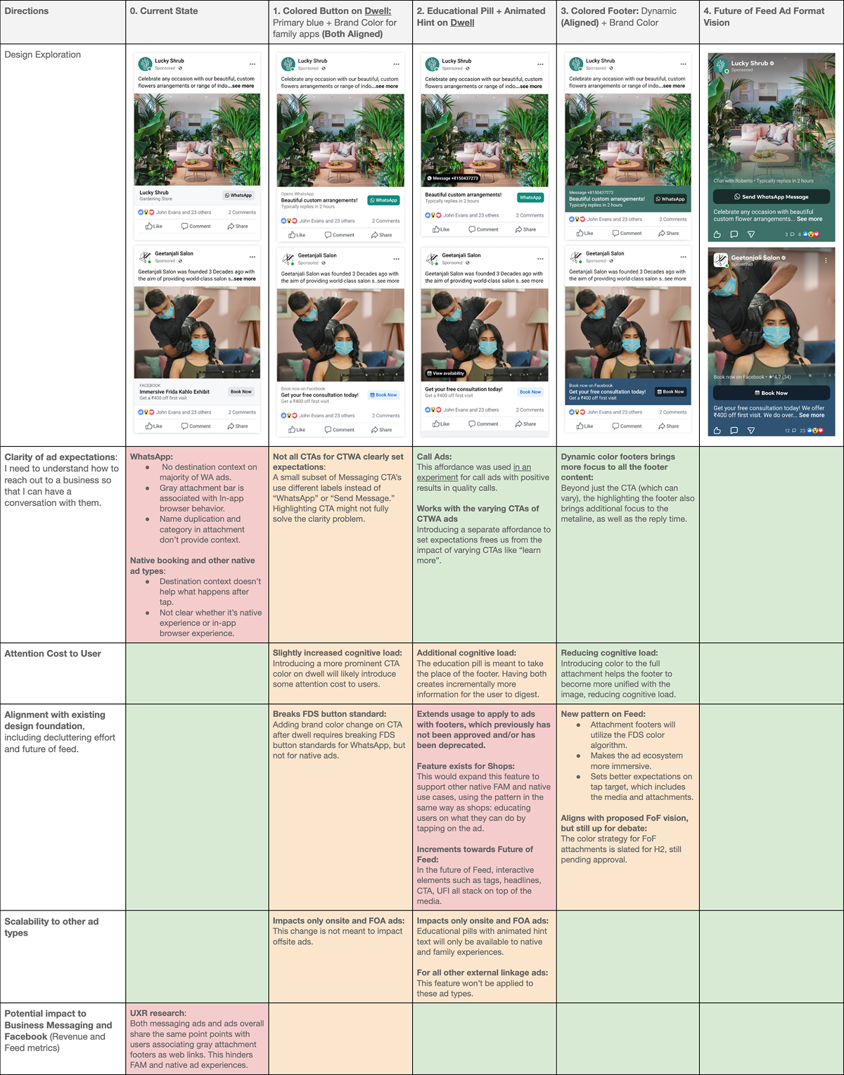
Framework matrix to evaluate designs
Step 1: Evaluation framework
Before exploring solutions, I introduced a shared evaluation framework to align five teams and reduce decision subjectivity.
Sharing this in a Google Doc before any designs let cross-functional partners give async input and reach alignment faster.
Scalability: Works across surfaces and future formats, not just Facebook Feed today
Design alignment: Builds on existing patterns; doesn't introduce new visual noise
Destination clarity: Is the outcome clear before the tap, regardless of CTA copy?
Impact: Expected effect on CTR, CVR, and conversations started
Step 2: Key insights from research
Insight 01
Destination signaling is a learned pattern. Competitors consistently use icons and brand cues to preview the next step. Meta didn't. Users had no visual vocabulary for "this goes to messaging."
Insight 02
Past experiments showed subtle WhatsApp cues, an icon turning green after dwell, an active status dot, meaningfully increased conversations started. The signal didn't need to be loud, but small cues drive large behavior changes.
Design principle
Signal the outcome at the moment of highest intent, not before, not after.
Phase 1: Fixing intent on Facebook
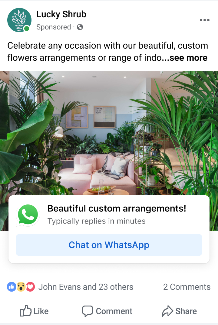
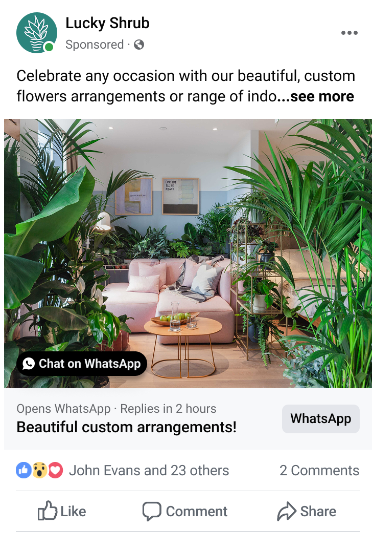
Link attachments on Facebook
Insight
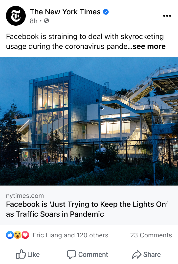
Messaging ads looked nearly identical to website ads while users scrolled. Users would make snap judgments and missed the destination entirely.
Facebook Feed design explorations
I explored multiple directions and after internal alignment, converged on last two.
Shipped icon and dwell experiments
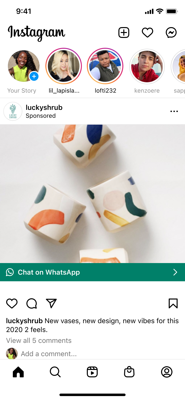
Colored CTA on dwell (Shipped)
Insight: Users decide in milliseconds whether an ad is "for them." Signaling too early adds noise, too late misses intent
Decision: Delay the destination signal until the user has dwelled on the ad, indicating real interest
Solution: CTA turns WhatsApp green (or blue for other CTAs) after a 3-second dwell, surfacing the destination at the moment of highest intent
Slowly test towards a future vision
Future vision
To align with Future of Feed, I shared a version that colors the entire footer attachment to group the CTA and messaging metadata visually.
Facebook Stories: Scope I identified and expanded
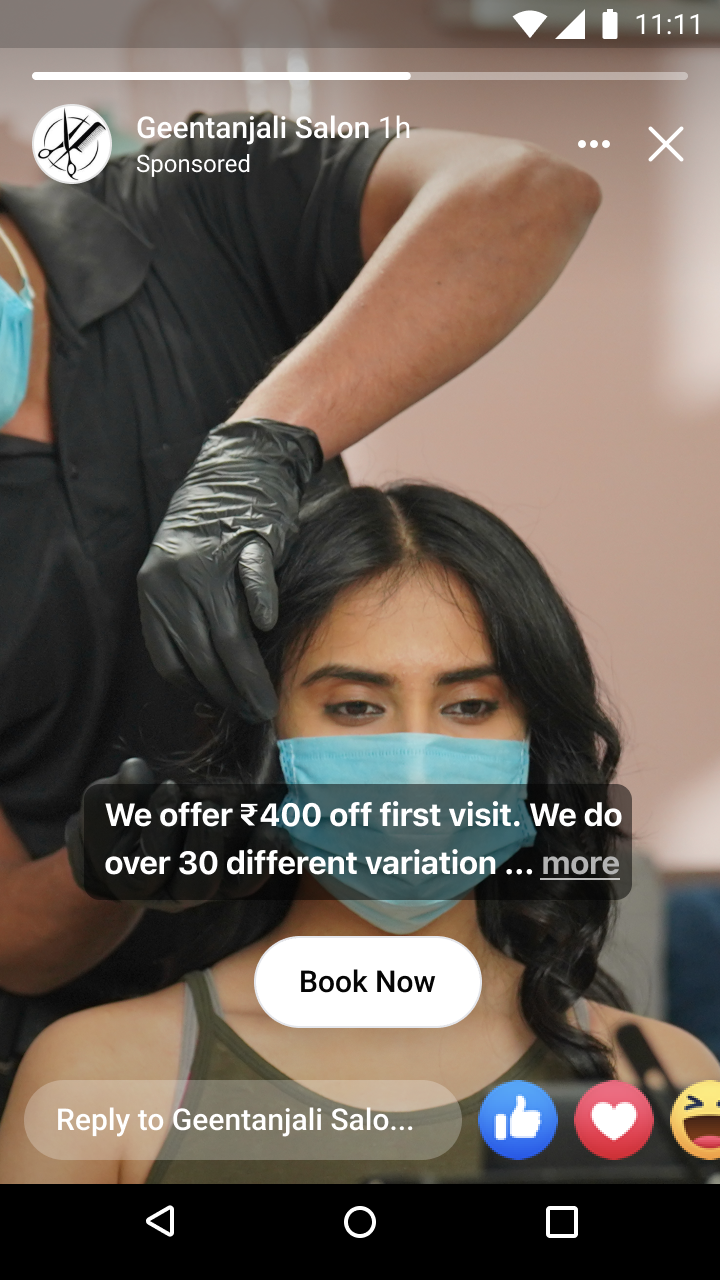
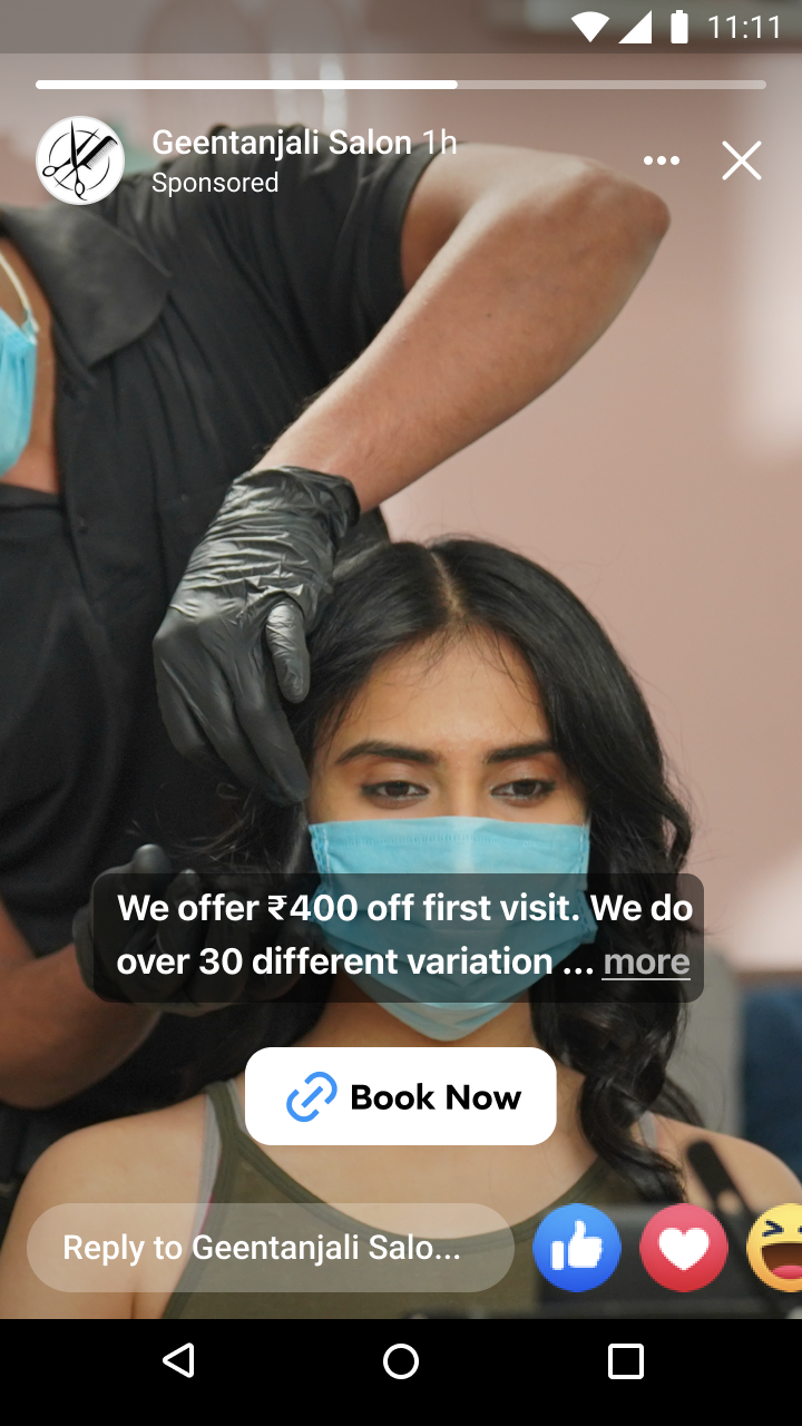
Updating Stories CTA's from buttons to stickers
Insight: While analyzing surface traffic, I found that Facebook Stories had the 3rd highest ad impression volume and wasn't included in the original brief.
Proposal: I proposed adapting interactive sticker CTAs from organic content to ads, a native pattern users already understood.
Delegation: I handed the work to a junior designer I was onboarding onto the team (IC3), used my influence to get it prioritized with the right teams, and kept him unblocked through execution.
Outcome: Became one of the highest impact wins of the half, and the project was a core part of his promotion from IC3 to IC4
As a IC5 at the time, the right move wasn't to own more , it was to create the conditions for someone else to do their best work on something that mattered.
- Staff level note
Phase 2: Fixing Misinterpretation on Instagram
The same product failed for different reasons on each platform:
Facebook: Users didn't notice it was a messaging ad → intent problem
Instagram: Users misread WhatsApp as Instagram DMs → identity problem
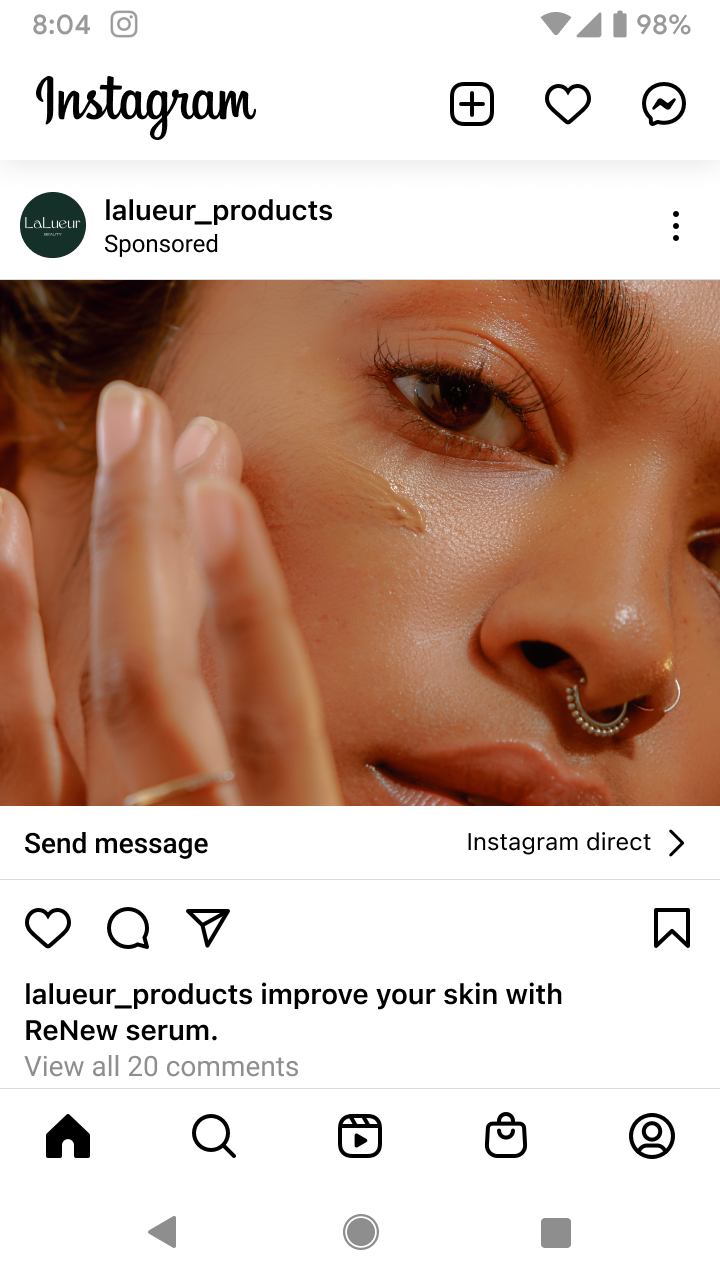
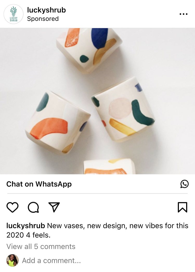
Initial IG messaging ad CTA's
Two constraints shaped the design direction:
Constraint 01
8.6% of WhatsApp ads use non-standard CTA labels ("Learn more," "Shop now"), so destination signaling had to be visual, not text dependent.
Constraint 02
Instagram Feed changes required senior leadership approval, including Adam Mosseri, so solutions needed to be minimal and precise.
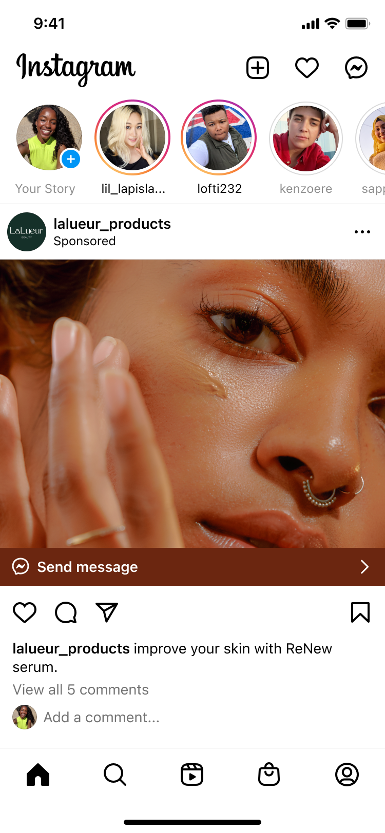
For messaging ads, a small destination label sat next to a chevron. Users would read "Send message" and miss the label entirely.
Explorations
Explored replacing the chevron with icons and multiline ad CTAs to surface more business/creator context, but found it broke existing patterns and added feed noise.
We decided to move forward with icon + label + chevron to maintain consistency.
Initial IG messaging ad CTA's
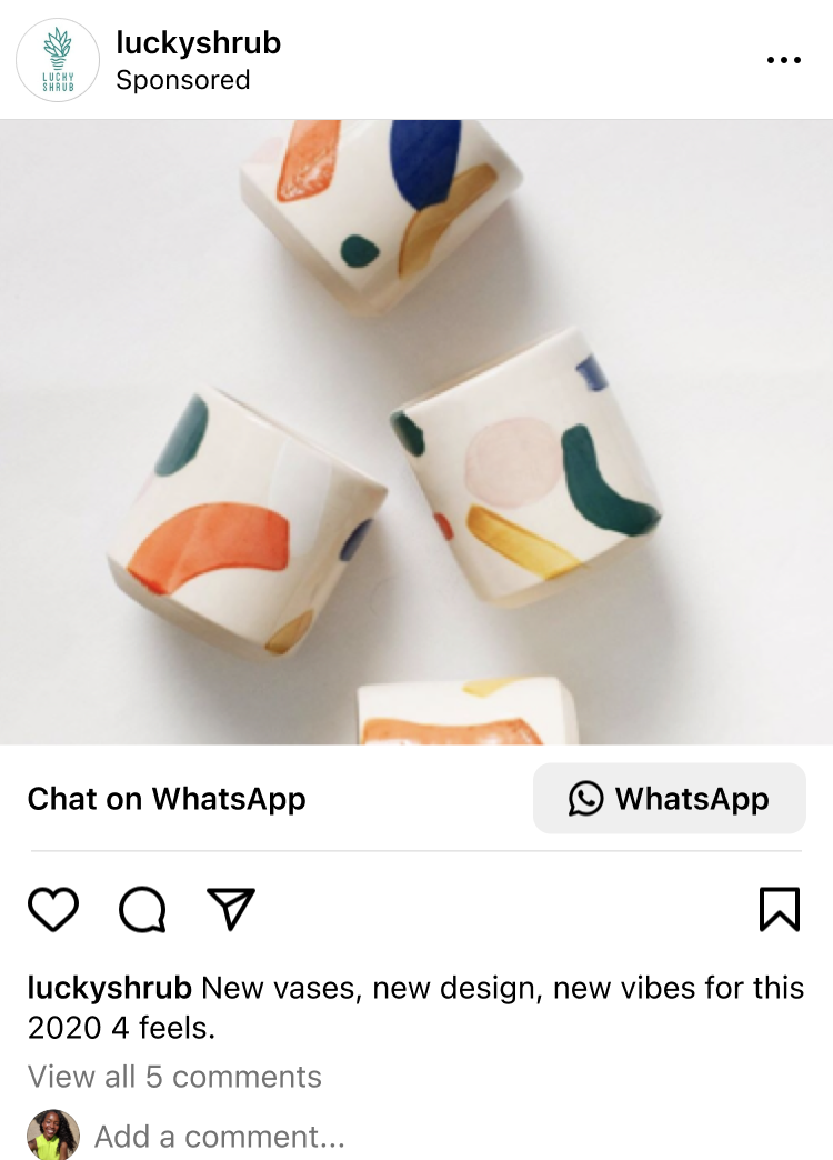
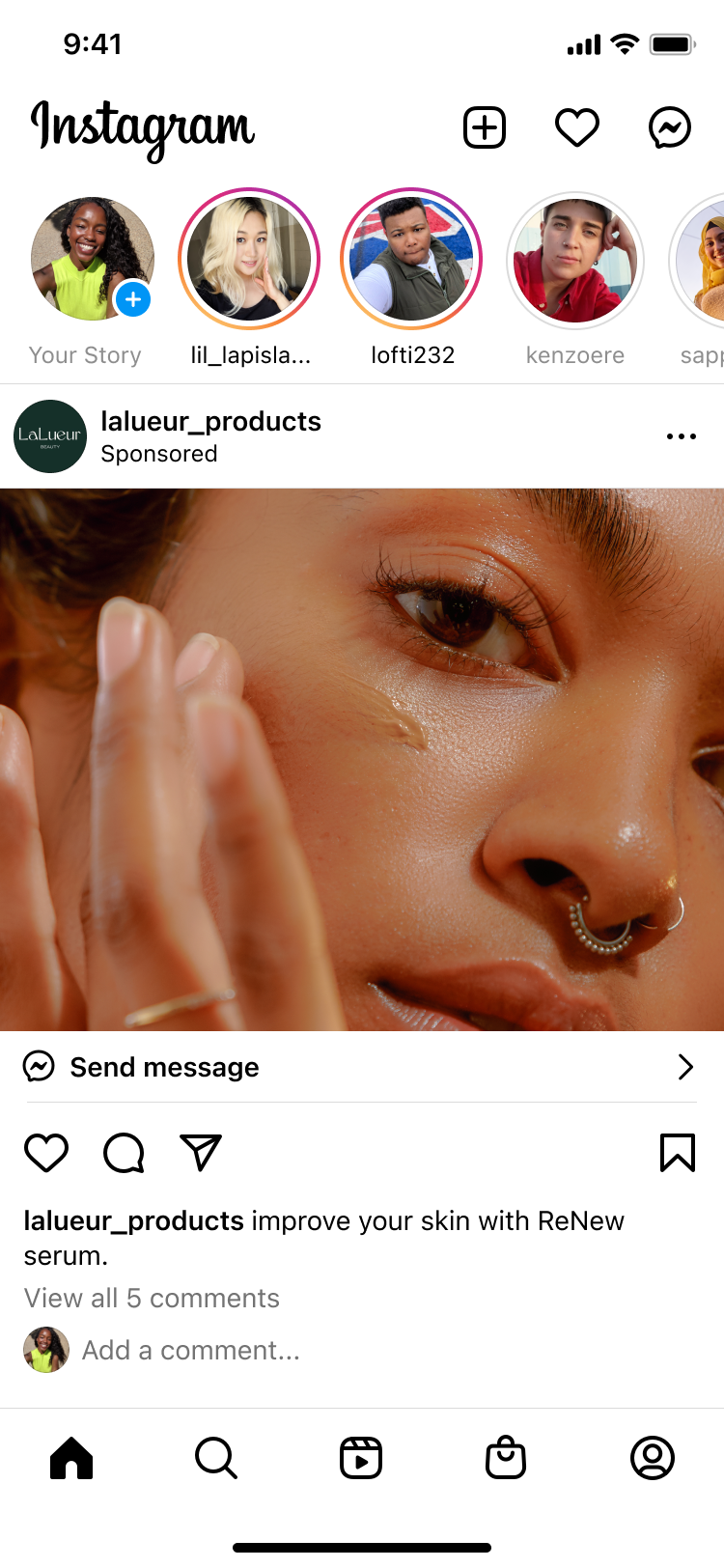
Messaging destination icons (Shipped)
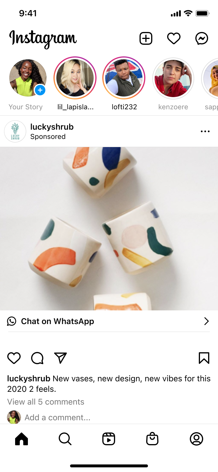
I moved the messaging icon to the start of the ad CTA, before the label.
A single small change with outsized clarity.
Instant brand recognition, no reliance on label text
Minimal visual complexity, no new patterns introduced
Works regardless of what the CTA copy says
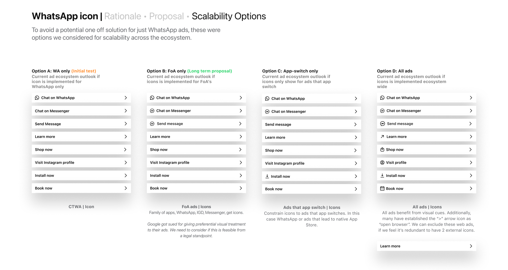
Framework matrix to evaluate designs
Scaling icons beyond messaging ads
Beyond the immediate fix, I proposed extending destination signaling across all ad types, turning a messaging specific fix into a scalable system for destination clarity across Instagram ad surface.
Impact
These changes transformed a major drop-off point into a growth driver:
+$150K daily revenue from CTA dwell improvements
+6.5× half-year revenue target (Facebook Stories)
+2–4% increase in conversations started across surfaces
+1.8% CTR lift (Facebook Feed)
More importantly, the work established durable organizational value:
System
Established a repeatable pattern for destination clarity across ad formats
Alignment
Aligned multiple orgs on a shared design and evaluation approach
Speed
Improved quality and velocity of cross team design decisions
Reflection
What worked
Aligning before designing
Aligning teams before designing unlocked speed and clarity across five orgs
Shared framework
Grounding decisions in a shared framework reduced subjectivity and accelerated stakeholder buy in
Designing for systems
Designing for both immediate wins and future systems multiplied the impact of each shipped change
What I would do differently
Earlier usability testing
Start with usability tests in Brazil and India as hypothesis inputs, not validation, early signal would have sharpened the experiment rationale
Expand scope earlier
Expand scope beyond Feed from the start. Stories, Reels, Marketplace, and Watch upfront would have driven larger, more cohesive impact from day one