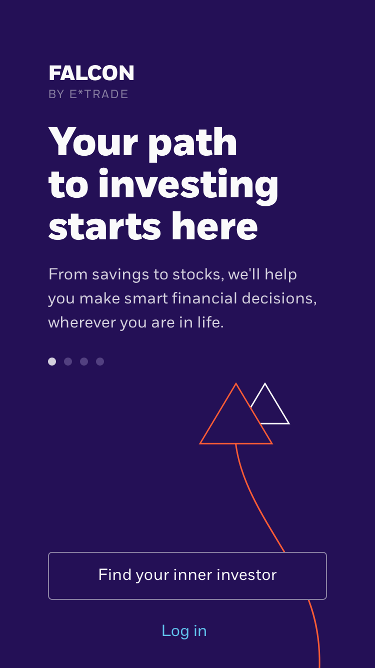
E*Trade Project Falcon
Investing for those just starting out.
Roles: Research, Visual, Branding, Strategy
A background
In the summer of 2018, Robinhood, a newcomer to the investment world, had just surpassed E*Trade in the amount of users. E*Trade, the first company to bring trading online, who had traditionally focused on successfully leading investors into affordable, self-managed investing, had drastically fallen behind when it came to attracting a younger audience.
It was time to inject some trendiness into E*Trade! Surely that would solve the problem! Unfortunately, for E*Trade there was something more challenging looming ahead. A survey conducted by Merrill Edge in the fall of 2018 of over 1000 millennials who had savings of more than $25K, found that 66% of millennials believe they will be able to rely on their savings account in 20 years. Compare that to 71% of Gen X’ers who said they would rely on 401K accounts.
Put shortly, the vast majority of millennials are not investing. What gives?
The challenge
Understand why millennials were not investing, and if they were, what were those avenues. Then, create a service that would empower novice investors to gain confidence in their financial planning, helping to bridge this gap.
Based on surveys conducted online and our research, which I will discuss later in detail, there were a few apps that millennials used, but with them came different patterns in behavior and understanding when it came to what they thought “investing” meant.
In order to help demonstrate the challenge, I designed a chart to illustrate the mindset of the emerging investor, and show E*Trade where they currently stood alongside their competitors.

If what we were creating was going to be successful, E*Trade needed to expand and push the bell curve sentiment back from “serious” investing to somewhere in between “optimistic” and “clever,” in order to accommodate different patterns of behavior.
The research
We conducted:
The key findings were:
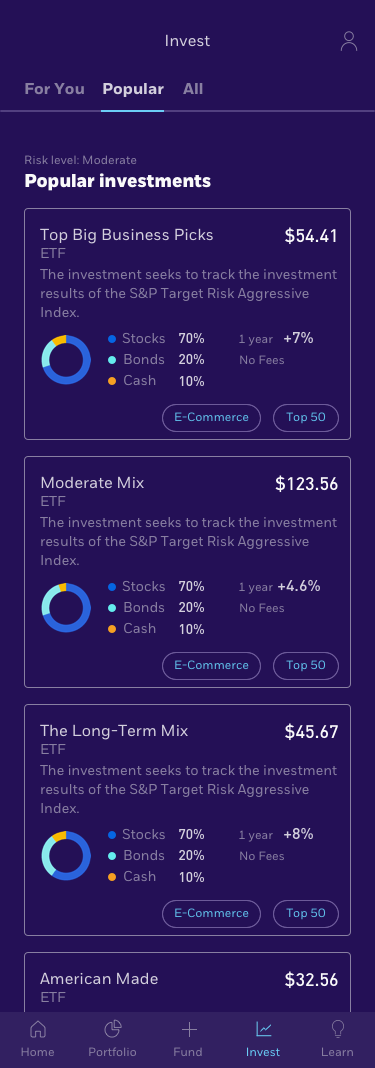
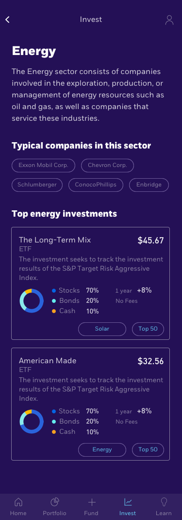
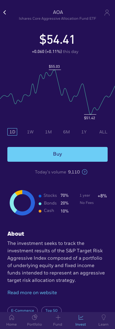
The scope
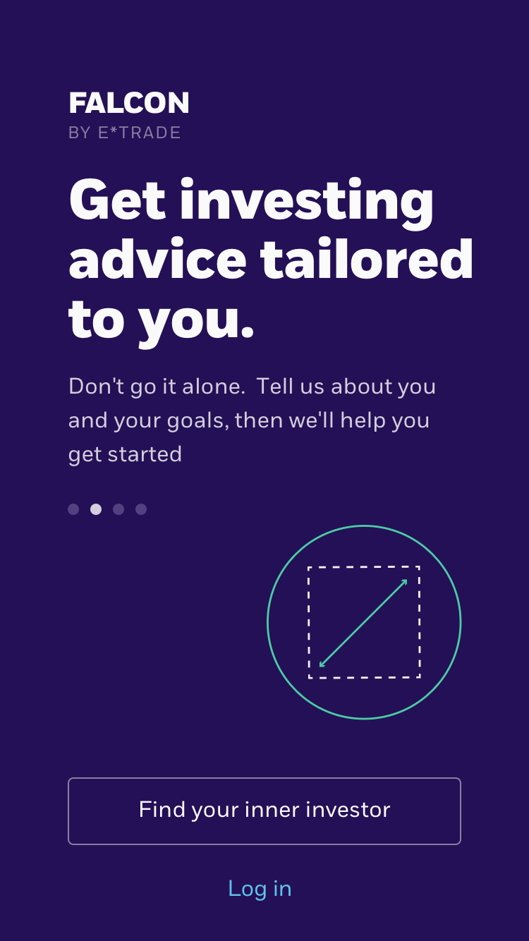
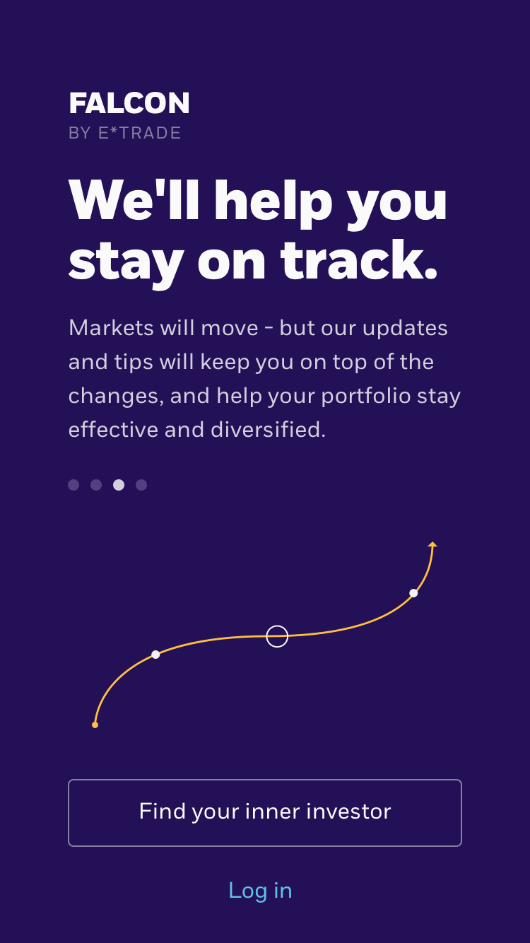
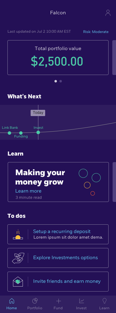
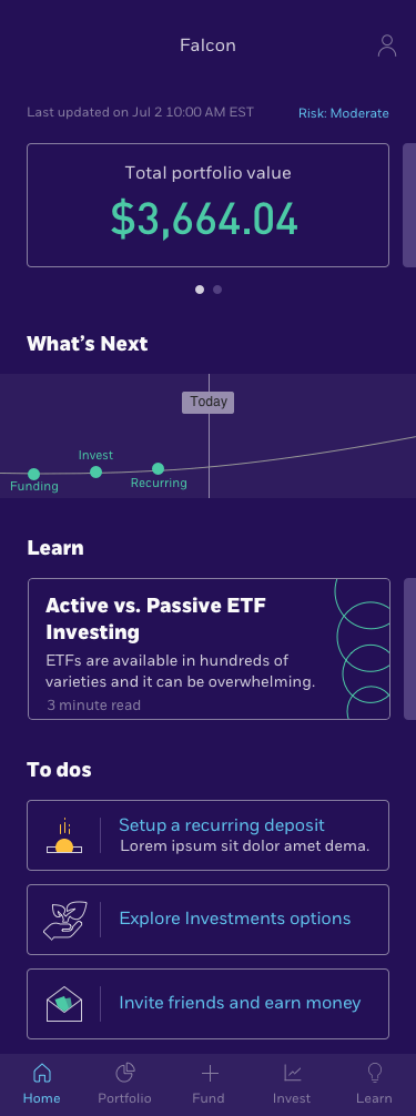
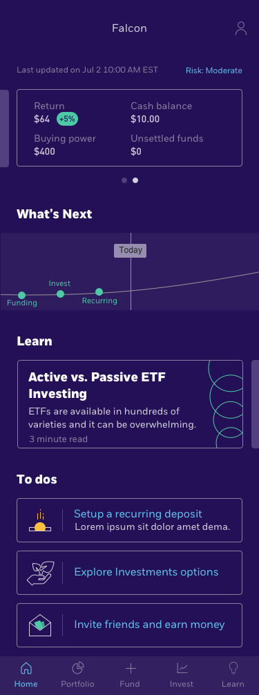
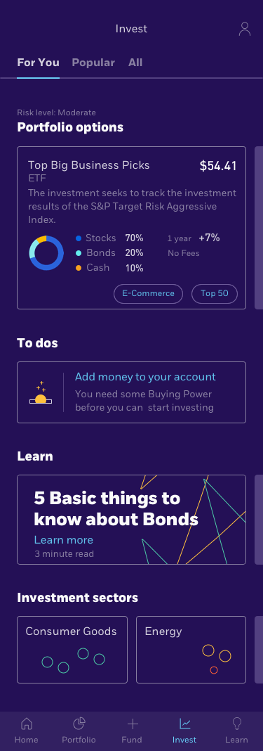
For MVP, the scope was to create 3 distinct user flows: on-boarding, signup, and account management, injecting what we learned at each stage.
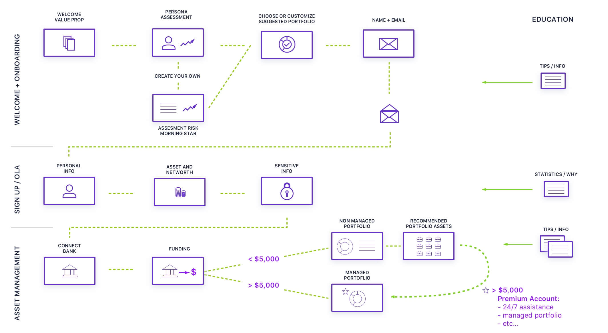
A note on a key business goal
A main business goal was to push E*Trade’s robo-advising tool. A big issue was that in order to open an account you would need to start off with $5,000. This was a major issue as research proved that many novice investors were not willing to invest that much upfront.
In order to keep top management happy, we created milestones in the application to hopefully get the user to meet the business goal, all the while still investing for their future in an experience that did not immediately disqualify them due to not meeting this minimum. In the end what mattered to us was to gain the trust of users and make investing as seamless as possible. There was much back and forth, but ultimately we were able to convince management to open this service to all.
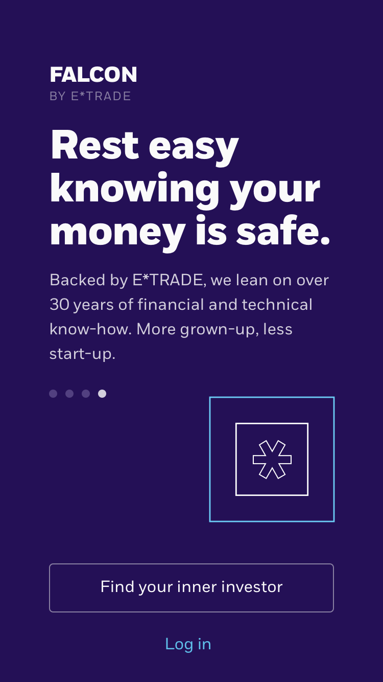
The initial wires
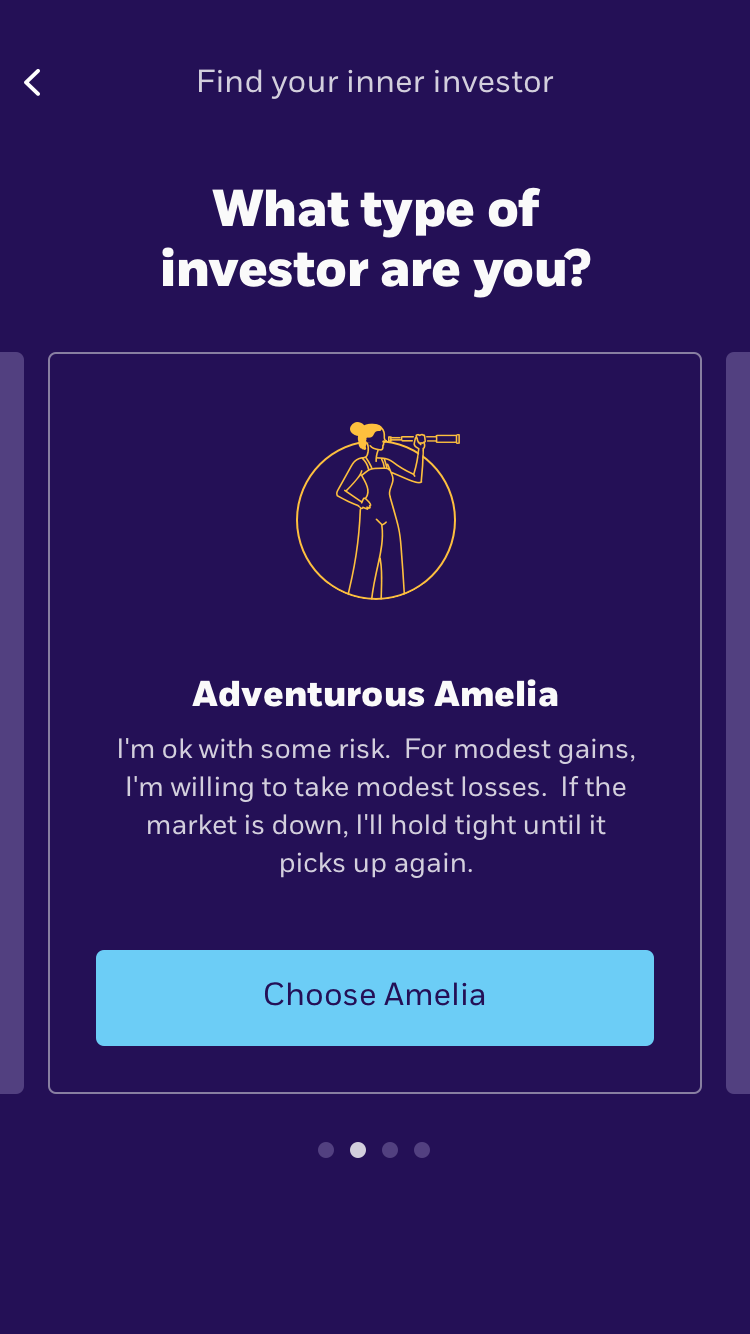
We started putting pen to paper with the thought of how might we lessen the entry barrier to investing and make it a bit more human.
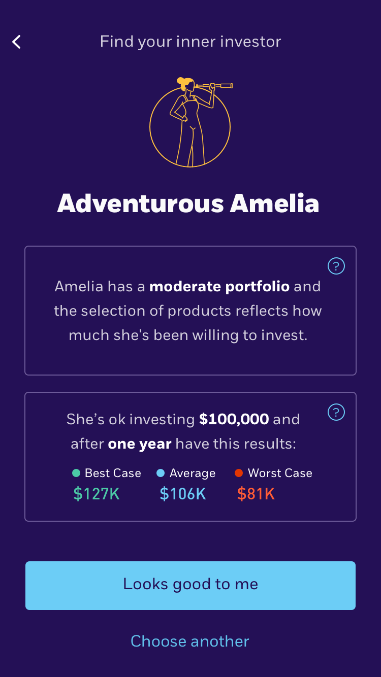
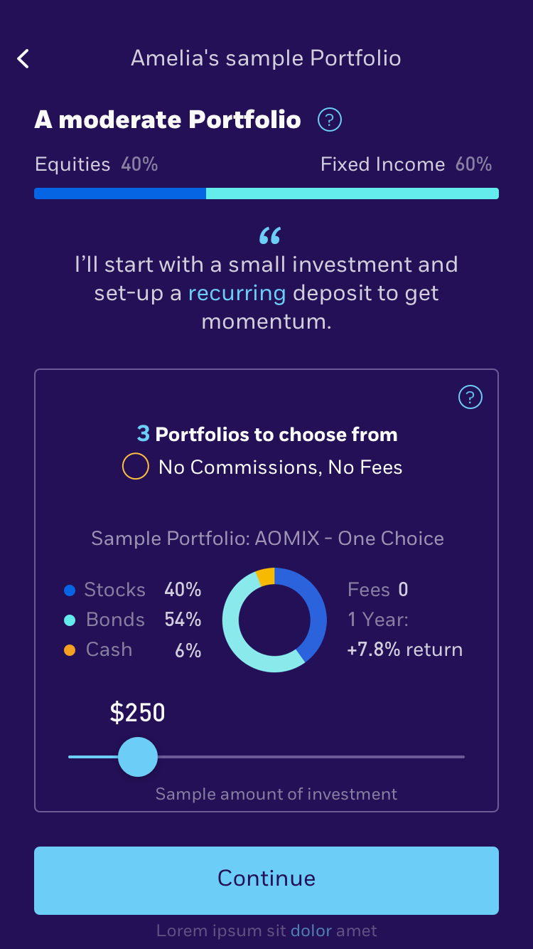
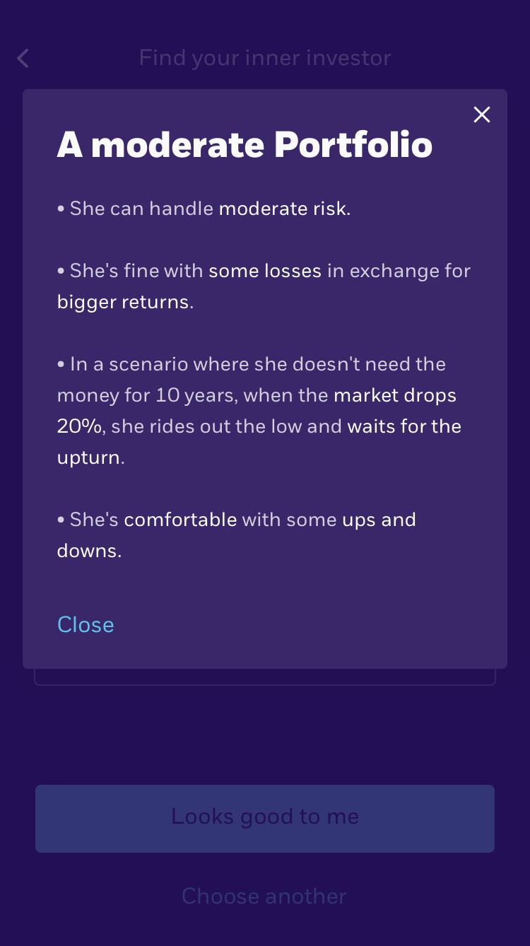
Based on the sentiment chart we saw earlier, I played with this idea of sentiment/attitude to determine what kind of investor you are rather than you going through a questionnaire to determine risk assessment.
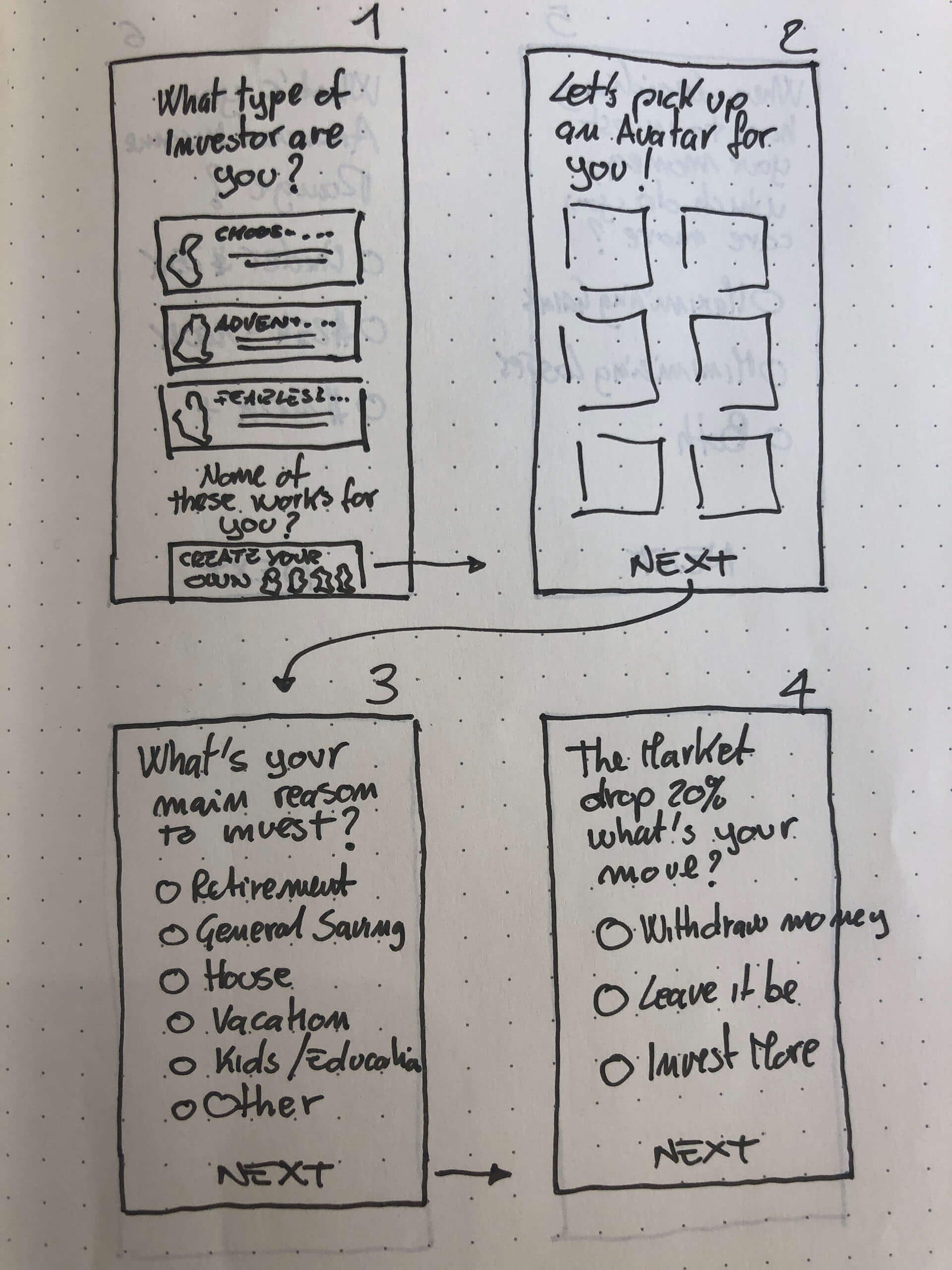
In the end if you were labelled as cautious, it meant you invested more in bonds, whereas someone who was labelled as fearless would put more money into stocks where they can stomach the fluctuations of the market more easily than their counterparts.
After testing this method with real users, along with other methods of determining personal risk assessment, users ultimately related choose this as a preferred flow.
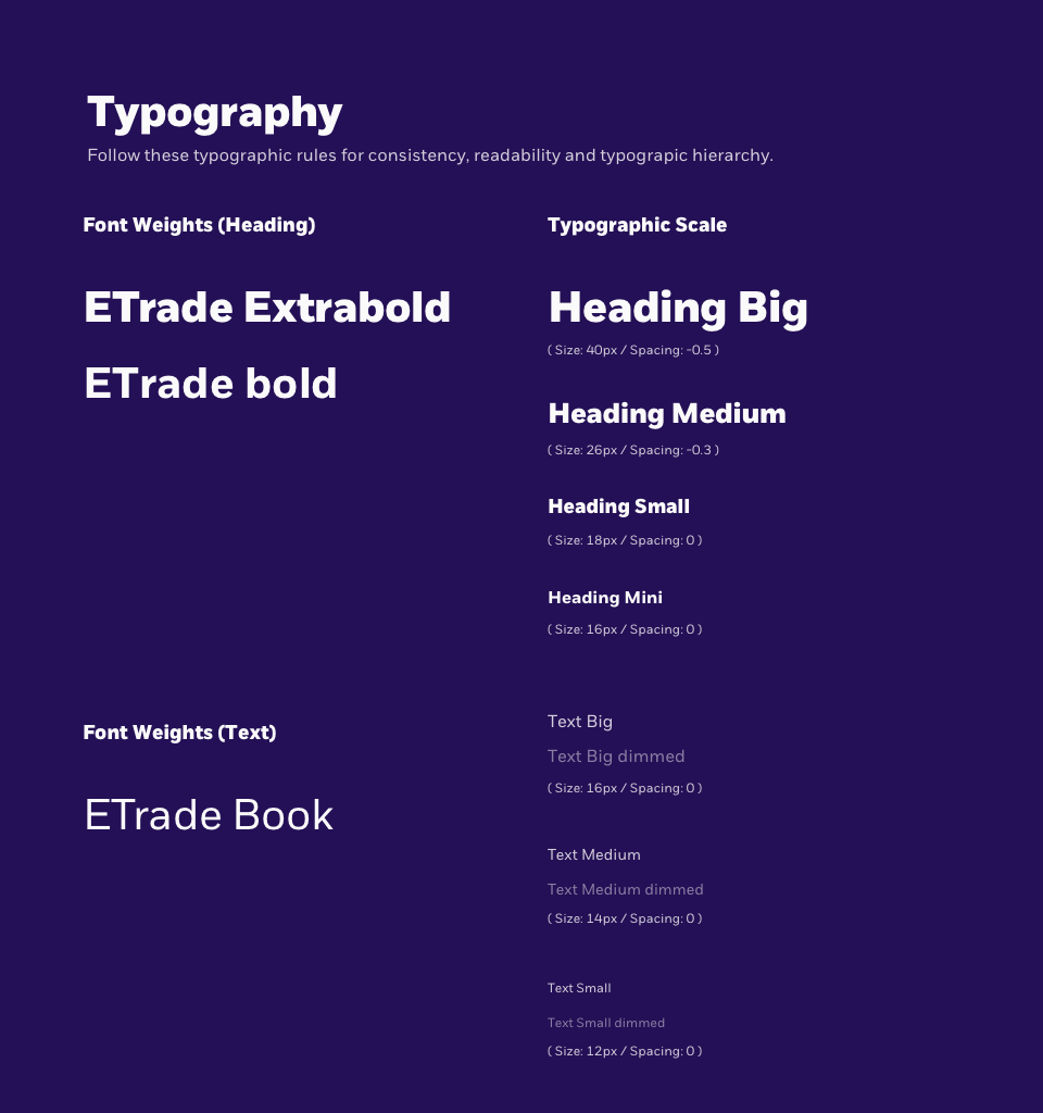
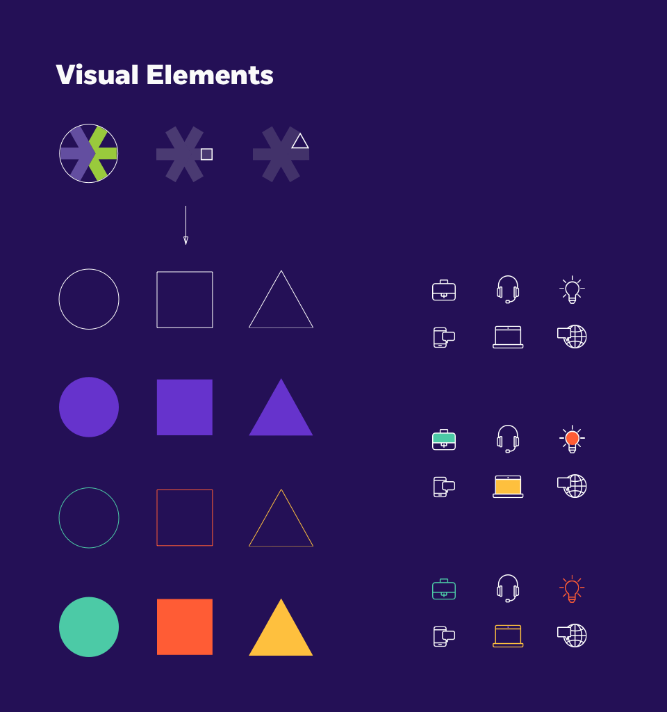
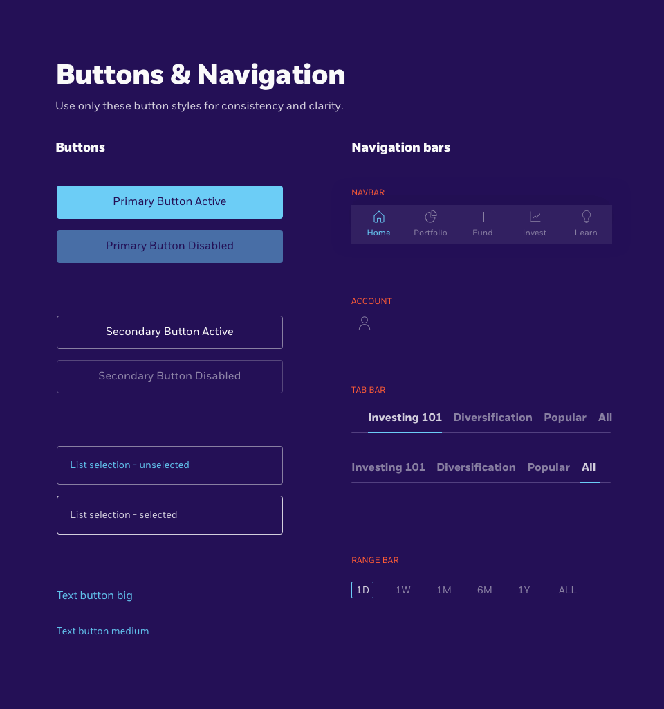
The design
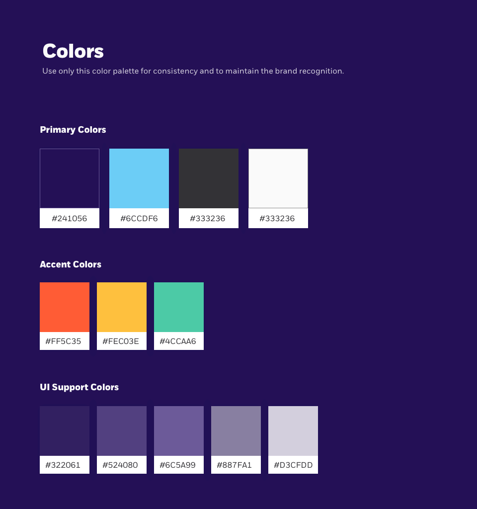
Though our scope did not include branding, we were still able to create a coherent style guide for this project. The style guide contained colorful, high-contrast, strong typography and photography, and line-work for illustration.
Educating stakeholders while having fun
I wanted to get the stakeholders excited about user journeys and scenarios. In the end, communicating design thinking to people who are not familiar with these concepts, helps all of us do our jobs better.
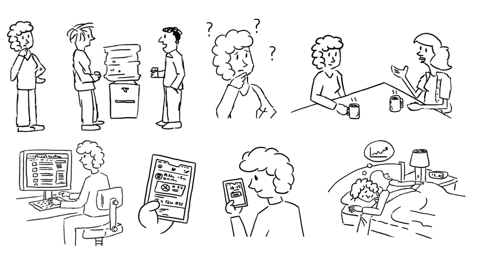
E*Trade worked right across the New York Times headquarters, so as part of illustrating scenarios, I adopted the NYT’s comic stripe style to help visualize the stories for the stakeholders.
Here are just a few illustrations. The stakeholders loved it!