
IBM PAIRS Geoscope
Big geolocation data is just a few clicks away.
Roles: Research, Visual, Branding, Strategy
The brief
IBM Research approached us with this new and exciting mapping tool they had just created. The tool itself was barebones, but the significant impact it could have on how people use large mapping data to discover patterns was unimaginable.
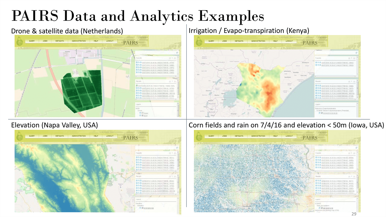
PAIRS is a platform designed to take geospatial (location information) and temporal (time) data from sources such as maps, satellites, weather, drones, IoT devices, APIs (i.e. Twitter), and contextualize that data to develop pertinent analytics.
Our mission was broken up into two phases. In the first phase we had to help brainstorm other uses for the application outside the realm of typical mapping analytics tools. The second phase was to develop the web based user interface for PAIRS.
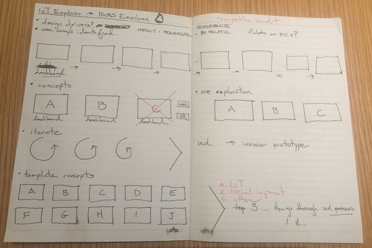
The first phase: exploring concepts
We met and collaborated with stakeholders and analysts to understand their expectations and come up with some design drivers to help us move forward with the different use case concepts.
We brainstormed quite a few ideas surrounding larger topics including:
- Education: There were two concepts: the first was the creation of a comprehensive interactive database on the history of global migration to understand our origins, history, and learn about our present, and the second was to create modules to be used for geography university classes.
- Journalism: A new way to visualize and contextualize news and events in their geographic landscape. This included a way for people who were in secluded parts of the world to tell their stories in hopes of reaching a larger audience.
- Social: There were two concepts. The first allowed you to view and share with your friends and family your mark, locally and globally, with your social media geodata. The second was a first response alert to people who were in your area in case of emergencies. The app would alert the authorities and other users regarding people in need of help.
We landed on Story of Me and News Explorer as the two concepts to further refine. We began with creating multiple personas, each with their own unique use cases and testing them against our concepts.
Concept A: Story of Me
For Story of Me we needed to accommodate two different uses cases. First, would be someone who was an experienced traveler and had many social media channels for us to plug in and generate a mapped journey. The second would be someone who has not necessarily traveled the world, stayed locally, and might not have social media, but wants to create a journey themselves.
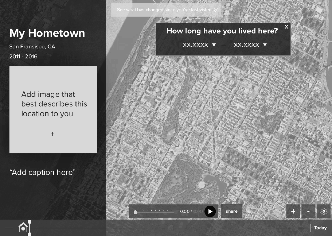
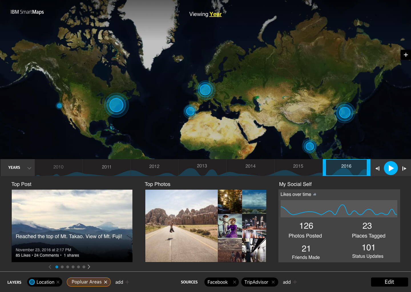


The final concept was built to accommodate many social APIs, including those from travel sites such as Lonely Planet and TripAdvisor. The platform not only plotted your footprint around the world but that of your friends as well. It gave users a way to see relevant statics such as popular hashtags in local cities to discover trends, information regarding the distance traveled or countries visited, and also notified you on who else had visited that country. It contained many other features that users could keep coming back to.
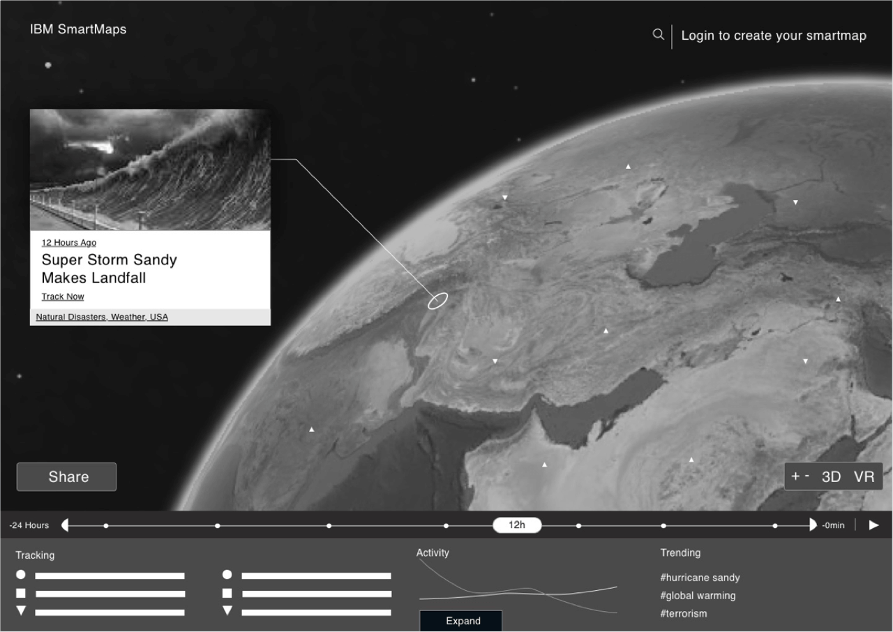
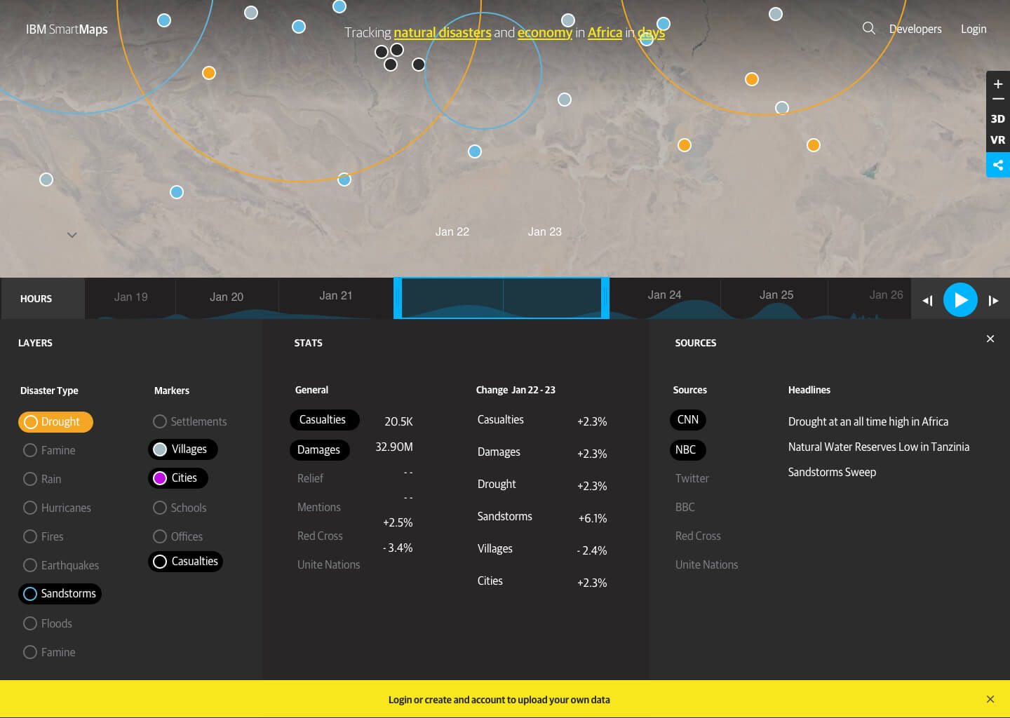
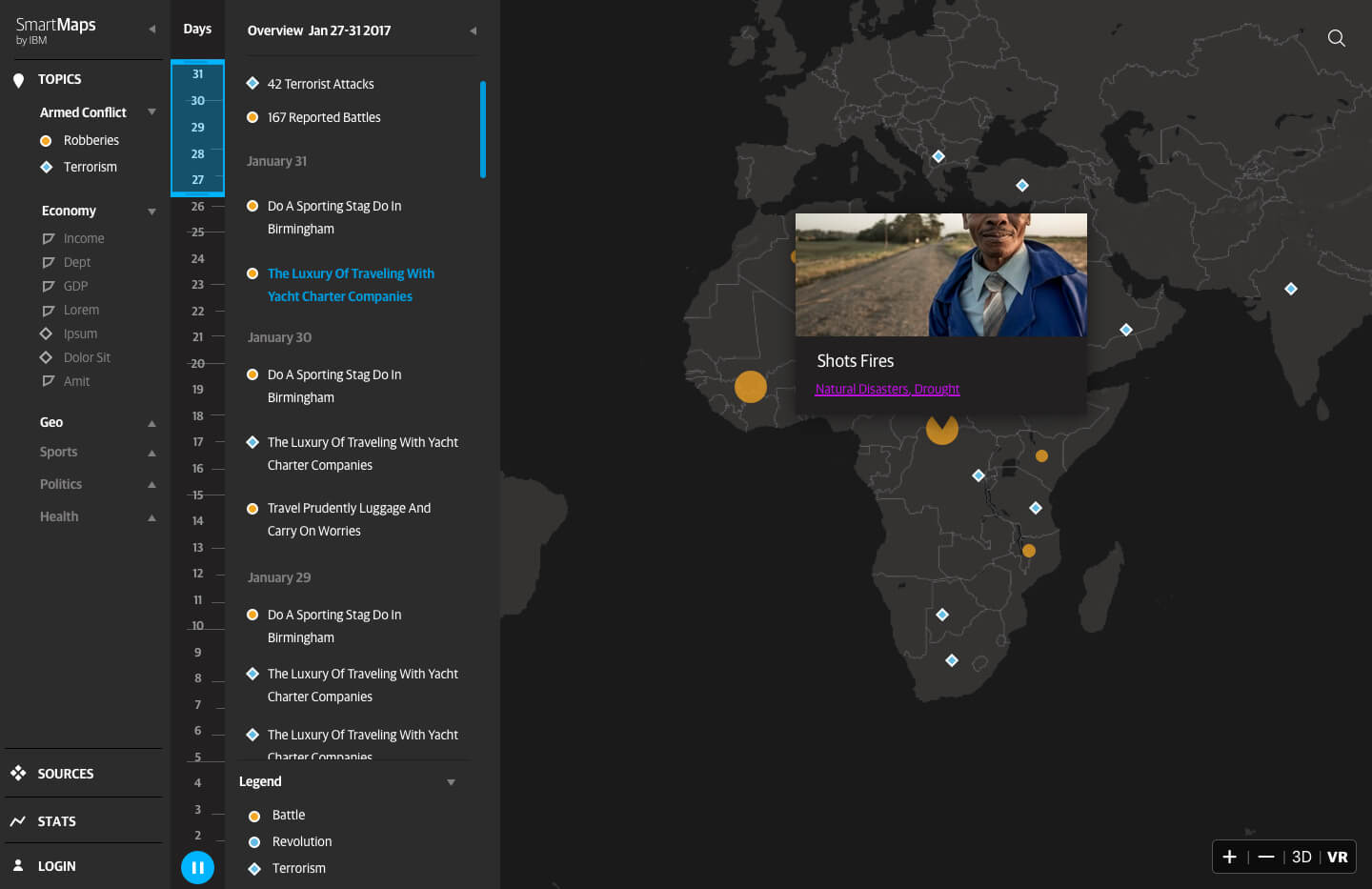
Concept B: News Explorer
The initial idea started out as a disaster relief dashboard. It featured a scrubber to monitor information as it was progressing, local relief centers with their contact info, as well as a module to input custom data. In the second phase we shifted towards a geotagged news exploring site. You could move around the world and see the news you wanted to see with a vast selection of pre-filters.
The second phase: designing how you map data
For this phase we needed to provide a search-friendly way to create visualizations for data analysts. To meet this goal, we conducted several interviews with data analysts and developers to understand their process. Once we understood what steps and parameters needed to happen in order for the user to get a visualization, we began to wireframe ways we could make the process as seamless as possible.
After testing the wireframes, we noticed a few problems:
- The panel system was a good start but it needed to be a bit more flexible. Rather than trying to show everything, it could be refined to take you step by step though the process. Some inputs also could be revealed and then hidden once the information was filled in, as it was unlikely developers would update that specific parameter.
- Language was getting confusing. Everything you do is a query by definition, but within a query were other queries to define the top query. We made some changes by renaming “queries” to “projects” as it meant the same thing, and its own queries to "subquery."
- We learned that queries, now known as projects, had parameters that were not dynamic, meaning that they could not change compared to the subqueries within that project. So there needed to be a system that distinguished those elements.
After our learnings, we moved on to creating the final designs.
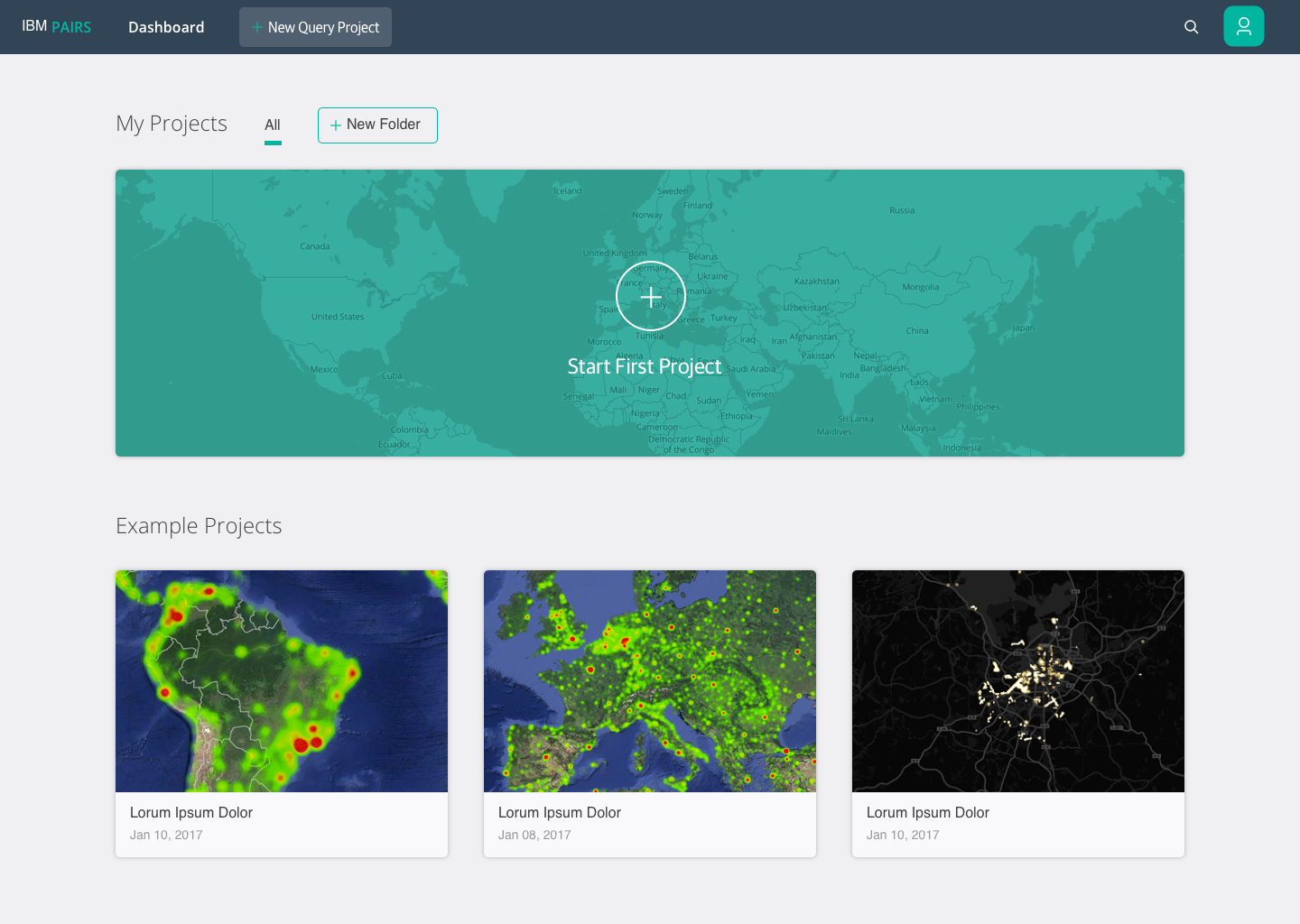
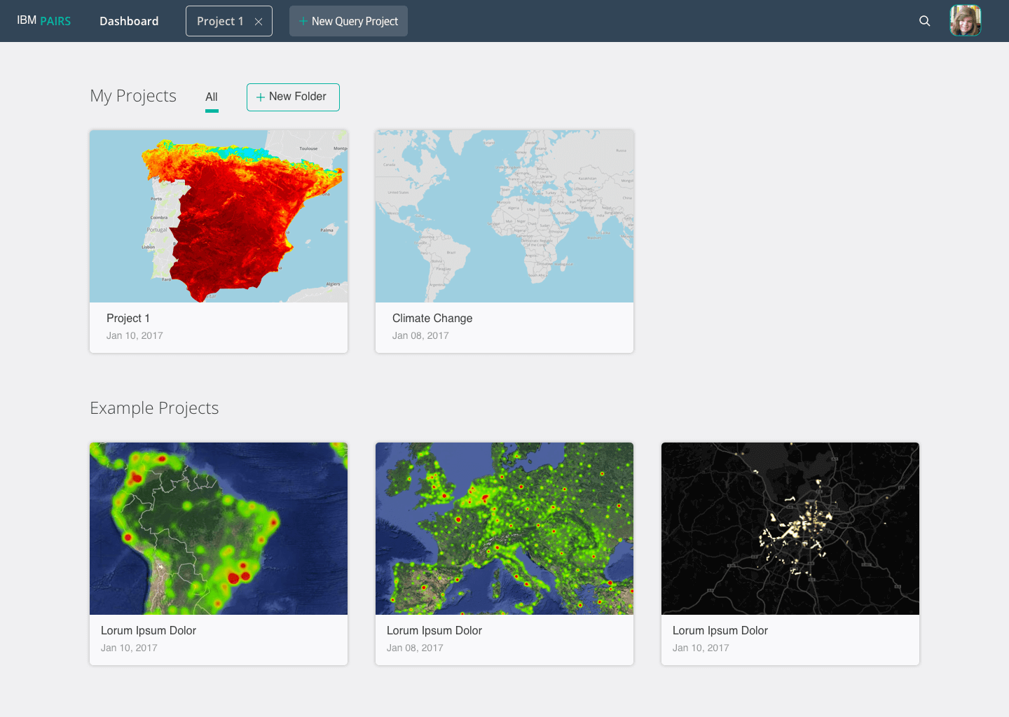
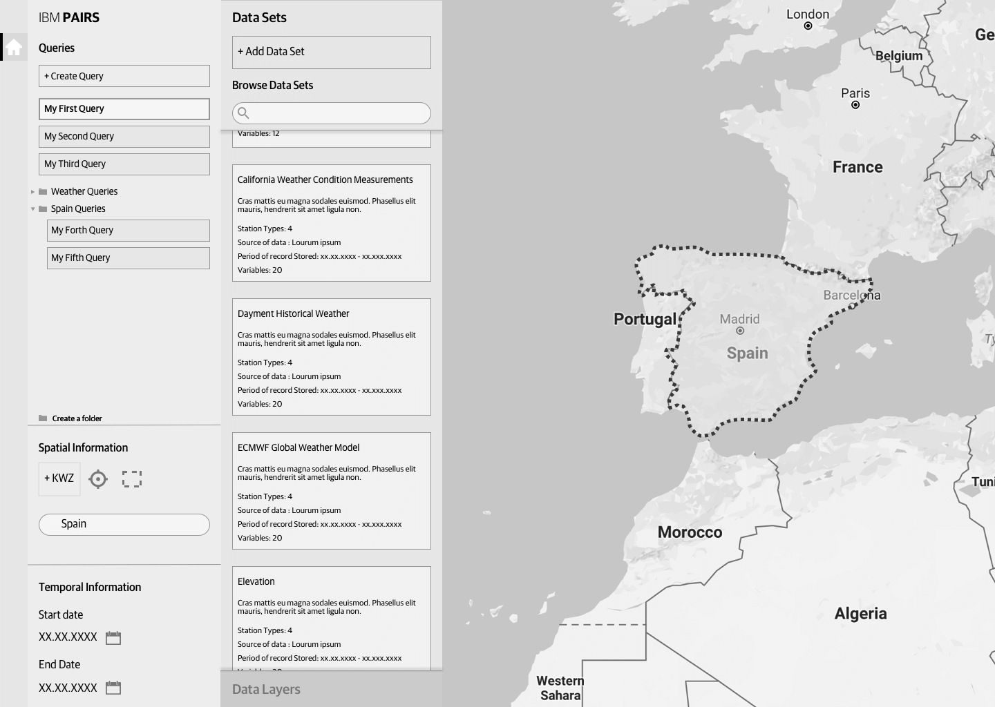
You can start your first query by clicking the top "+ New Query Project" button or by clicking on "Start First Project." We provided example projects to inspire and help users familiarize themselves with the tool and how the outputs were created.
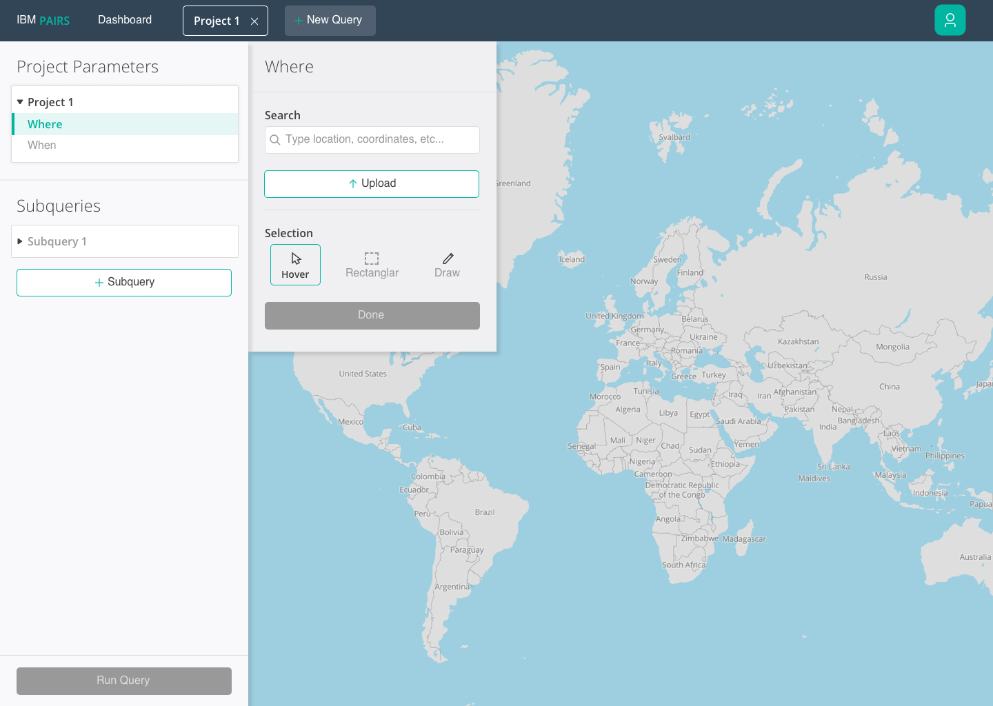
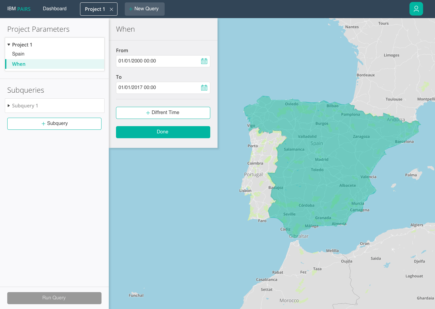
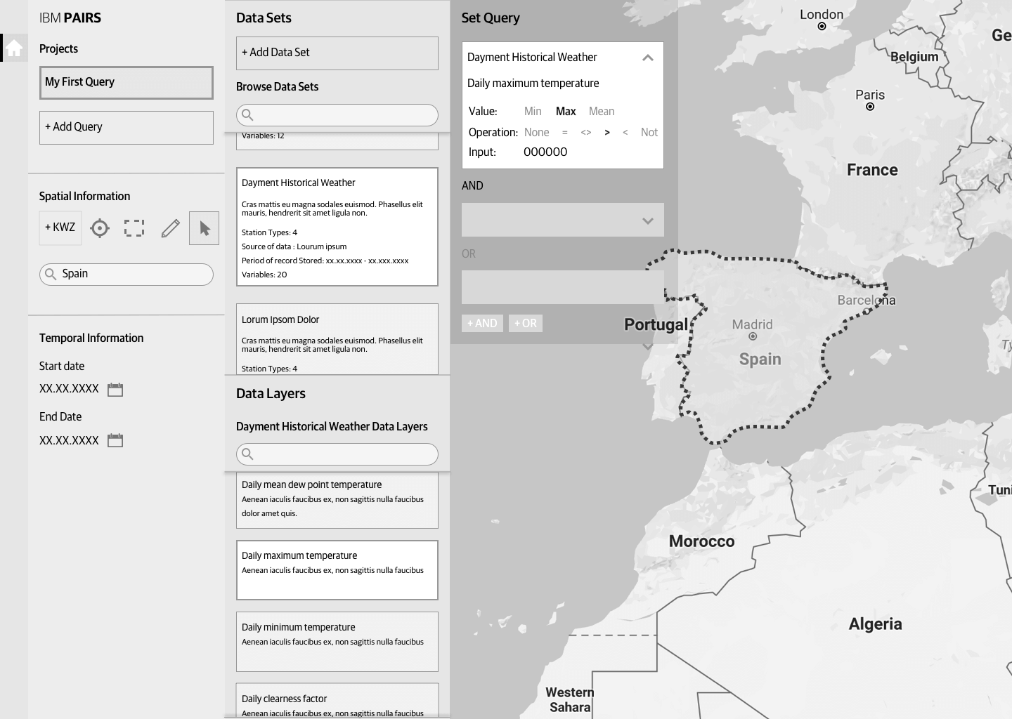
After creating a new project you have to set the project parameters which will remain constant throughout the query. When defining the area, you have the option to hover over countries or cities by zooming in, use the rectangular marquee, draw, or upload your own coordinates. After selecting the where, then comes the when. The time is so you can view a playback of the data as it changes over that predefined time.
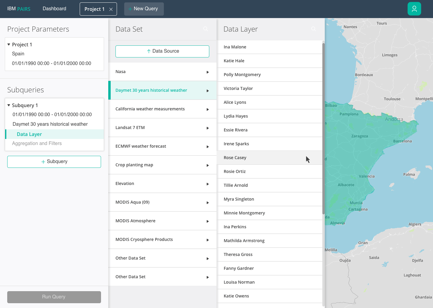
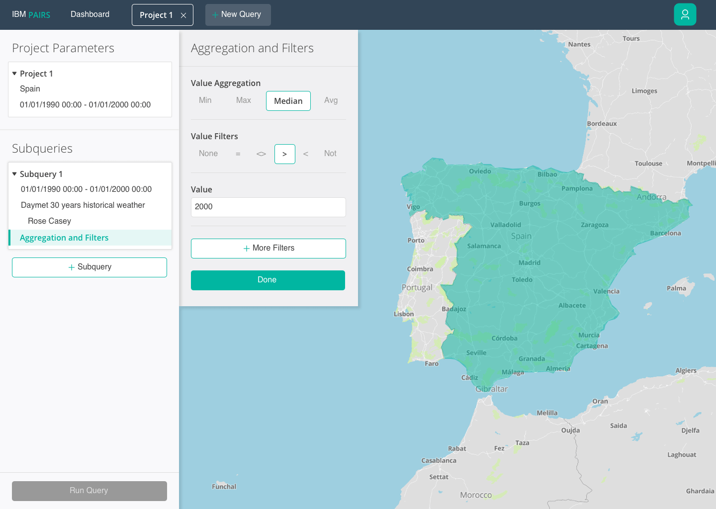
The next step is to select a data layer from either predefined Data Sets or your own uploaded data source. To finish off the subquery, you then set the aggregation and filters.
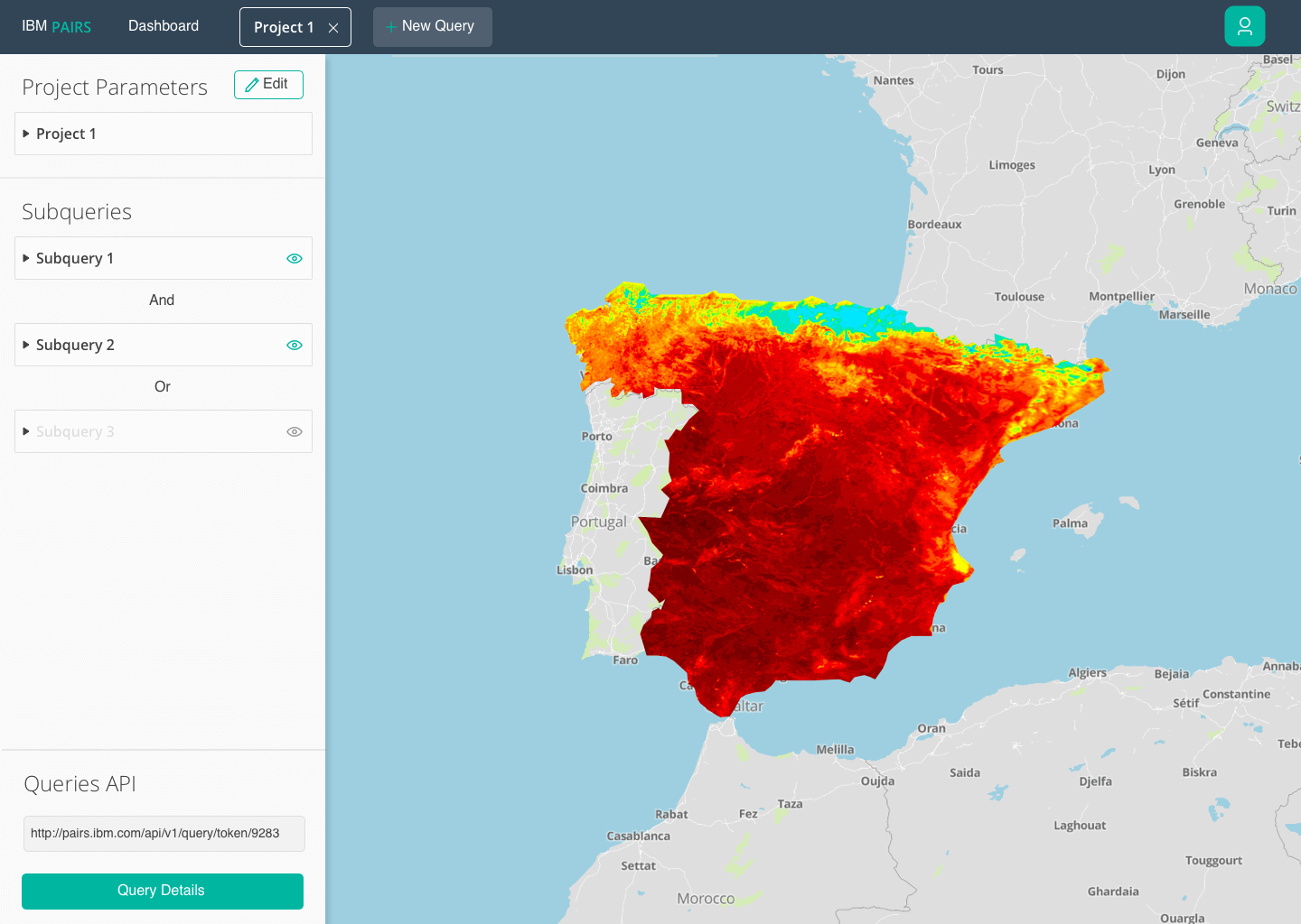
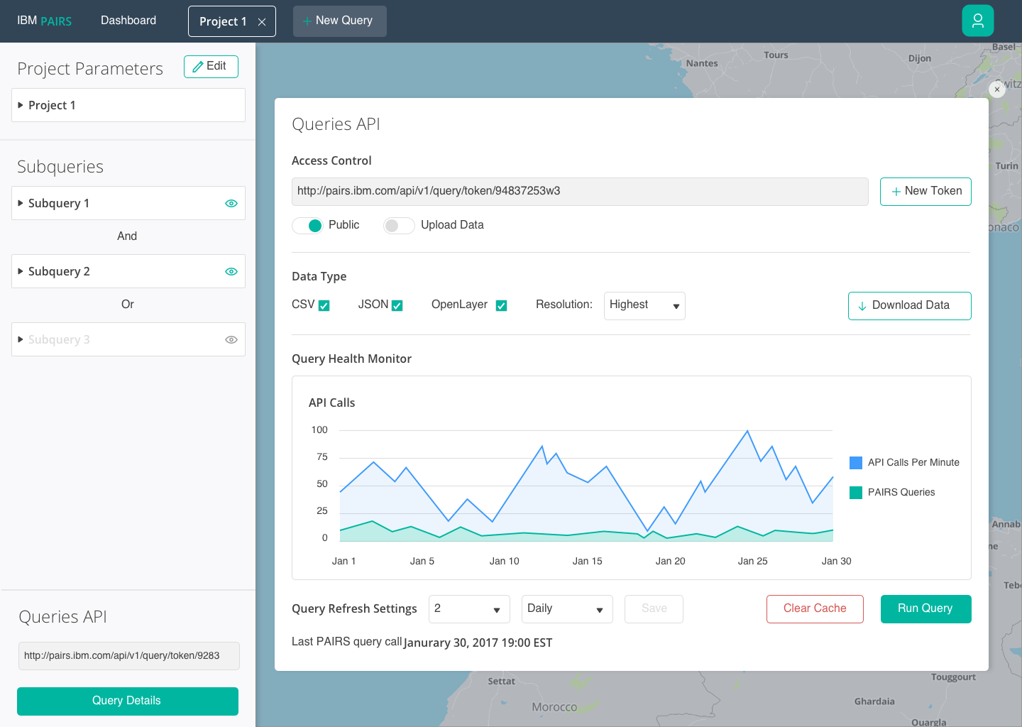
Finally, once you have defined another subquery and run the results you get a visualization, which you can then take the data and import it into a powerful JS visualization tool such as MapBox or OpenLayers. You can also access the API and view its API calls and adjust accordingly.
Reception
PAIRS went public for enterprises to use for free back in March 2018. The reception since its launch has been positive.
When referring to the UI we created, TechCrunch said “…a web-based interface that makes it easy to select different layers, manipulate them and combine them to generate new queries.” Link to TechCrunch article.
It was also featured in Forbes, ZDNet, and other big tech magazines.
The concepts are currently featured in the tool as example projects. But most importantly they helped secure funding from the IBM executive team in order to continue work on IBM PAIRS.