

Insurance claims visualized
Roles: Research, Visual|Read time: 2 mins
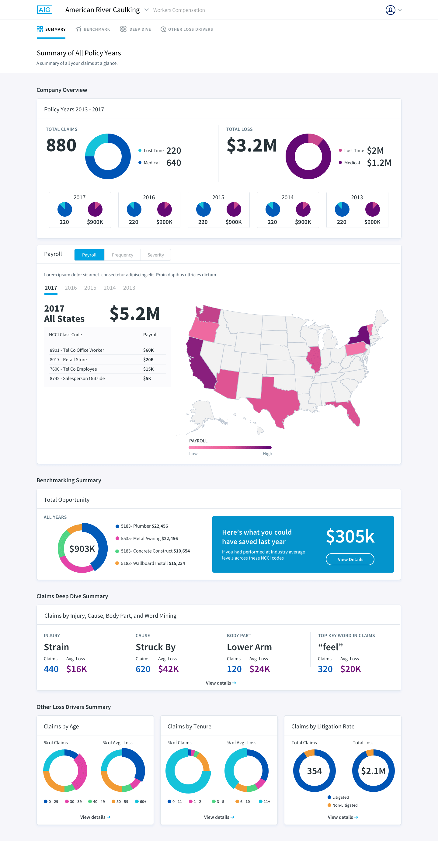
AIG, one of the largest insurance companies in the world, reached out to help redesign their internal claims analytics tool to potentially market this to other companies as part of their insurance package. Not only did the data need to make sense, it had to look beautiful. For this client, charts alone were not going to suffice.
The tool was initially created by developers alongside with data analysts. So naturally the tool was not only hard to navigate, but the data itself was a bit too complicated to interpret at a quick glance.
I had to convince the client that I needed to devote a week from the month long engagement to understand the data, as well as navigational elements. In the tool, some bar charts allow you to click in, to get more information while others you could not, but you would not know that unless you built this tool.
As much as the client was hesitant, it was easy to convince them once I started point out the confusing elements which needed clarification. I needed to understand how the tool worked and in order to do so, I needed to interview the data analysts who funneled information into the tool, as well as the people who used the tool's data to put together yearly reports for their clients.
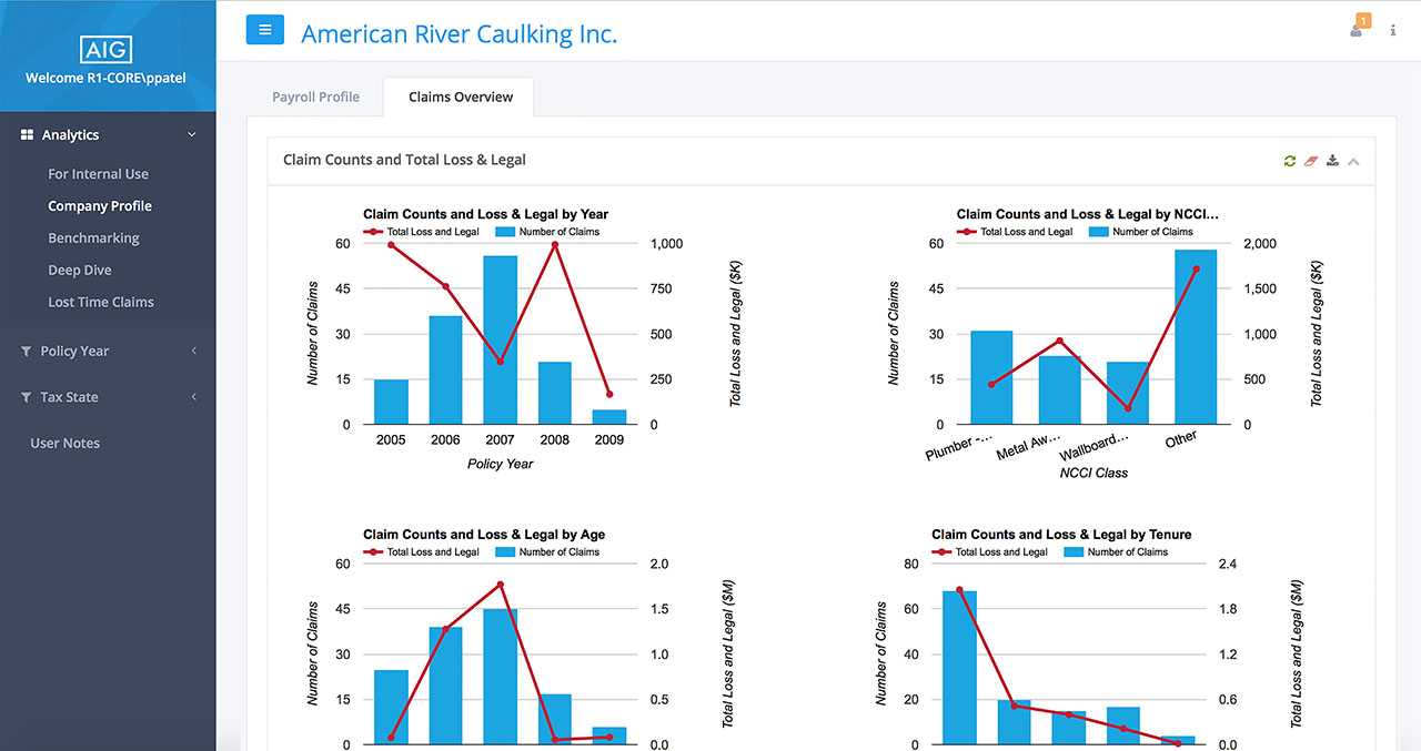
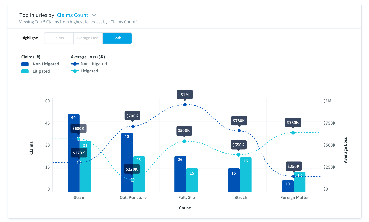
The biggest challenge by far was that most of the data had two distinct variables: in most cases "money" and "claims amount" against one constant which would either be the injury, year, or cause of accidents. This gets confusing as often we are use to comparing one data point (a variable) to one constant. To make matters even more complicated some charts had 4 data points, as you can see in the chart below.
I presented multiple ways of tackling the challenge of the chart above which was the most complex chart in the system.
In option 1, I start by having just the claims tab open so that the user is focused one variable rather than all. The other variable however is still visible but faded into the background. The user can click on “both” tab if that is what they wish to do. There is also an obvious way to filter just above the chart with a clear indicator that you are viewing highest to lowest by a certain filter.
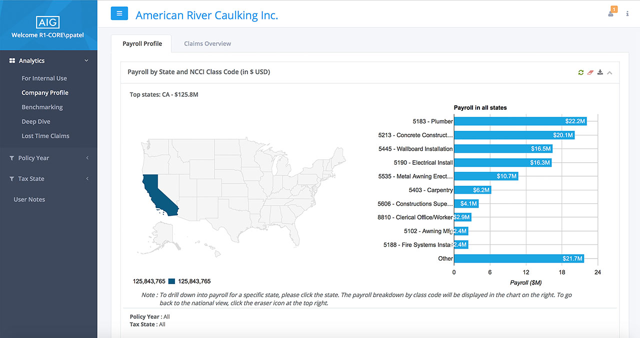
In option 2, I flip the variables. On the Y-axis, you have the constant and on the X-axis you have the variables. This by far was the easier read of all the options presented as each variable lived in its own section rather than overlapping, or tabbing through variables and yet it still correlated to the constant. Blue meant claims why red meant average loss.
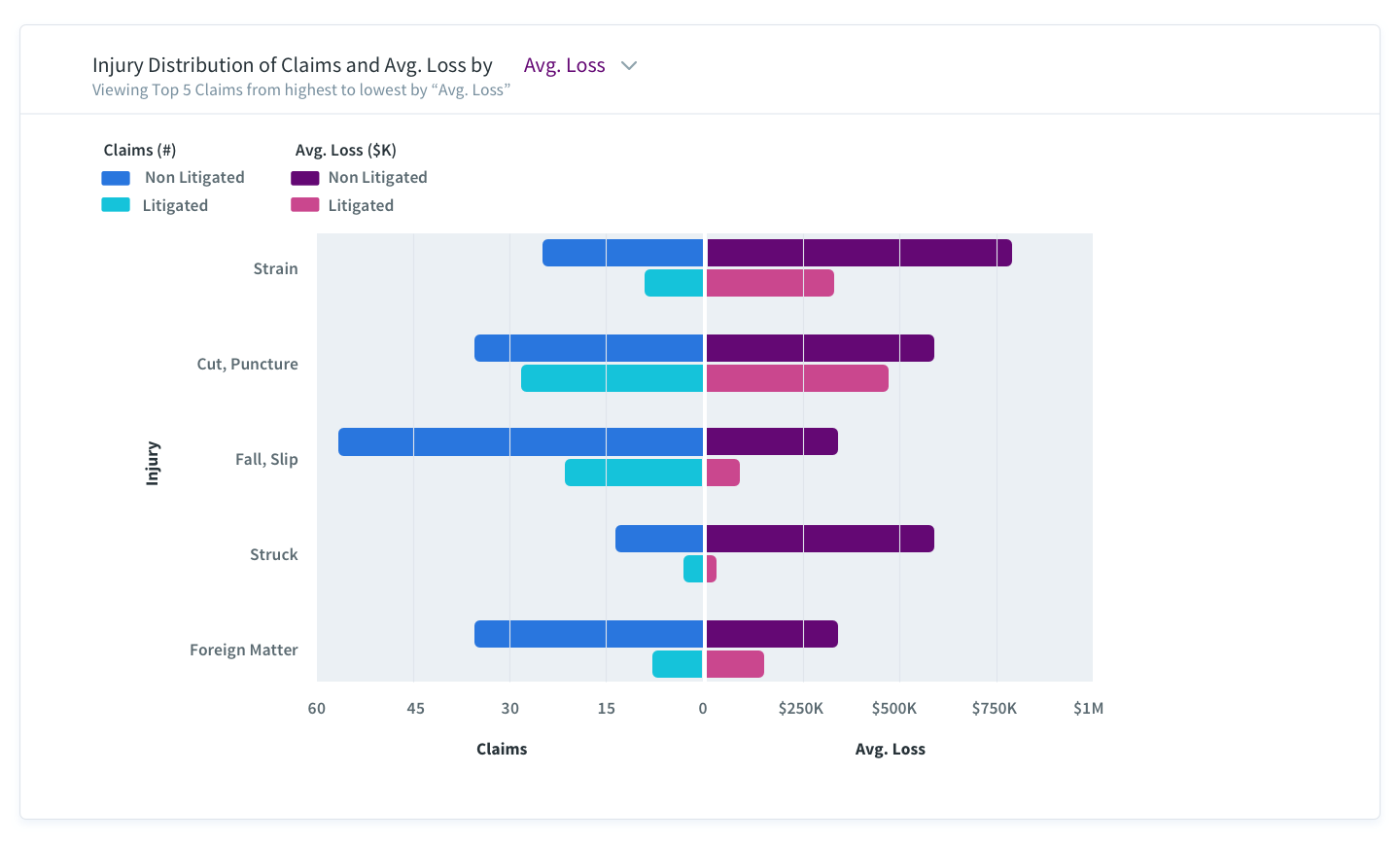
In this example, charts could work but the client wanted to see more data visualization.
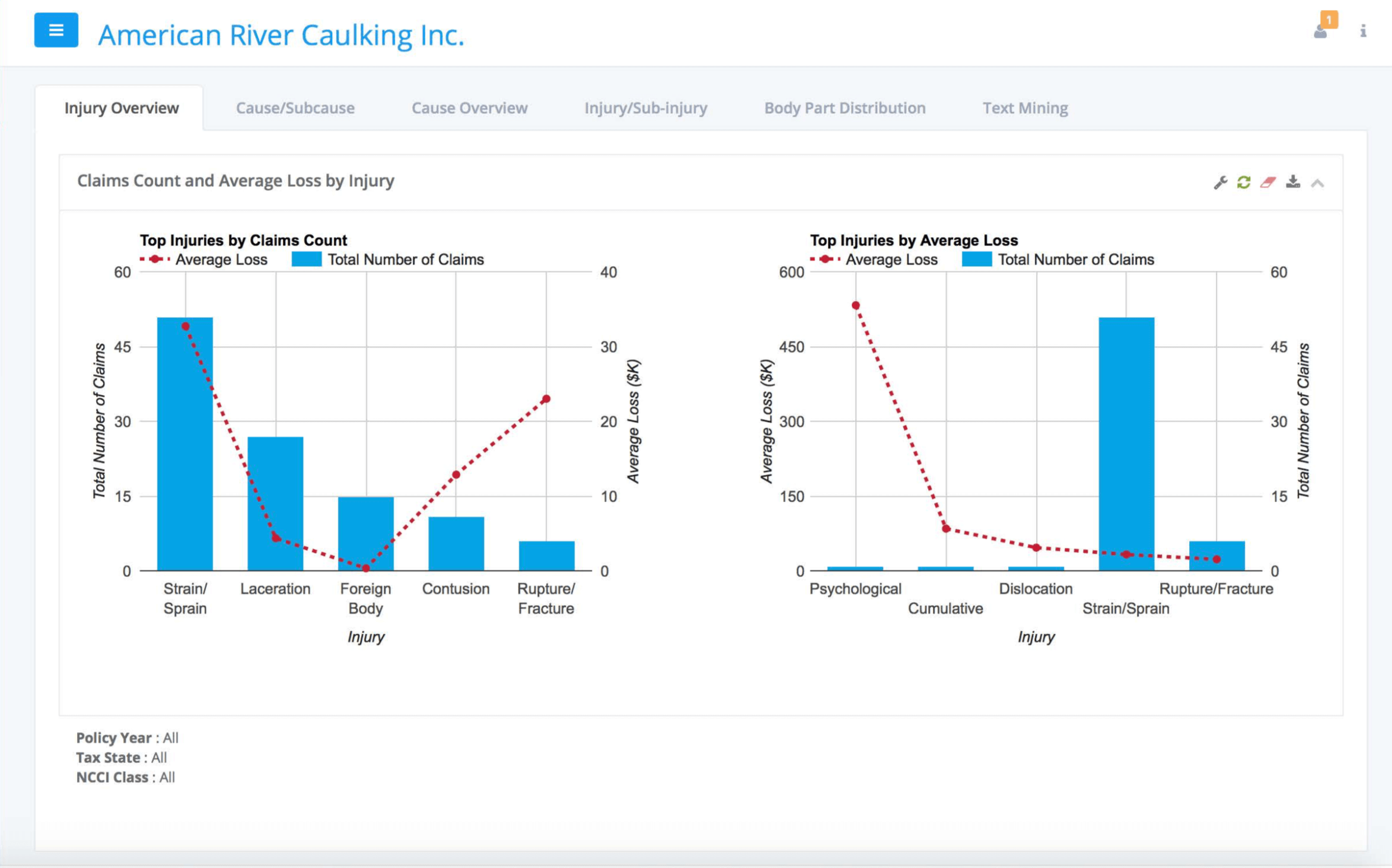
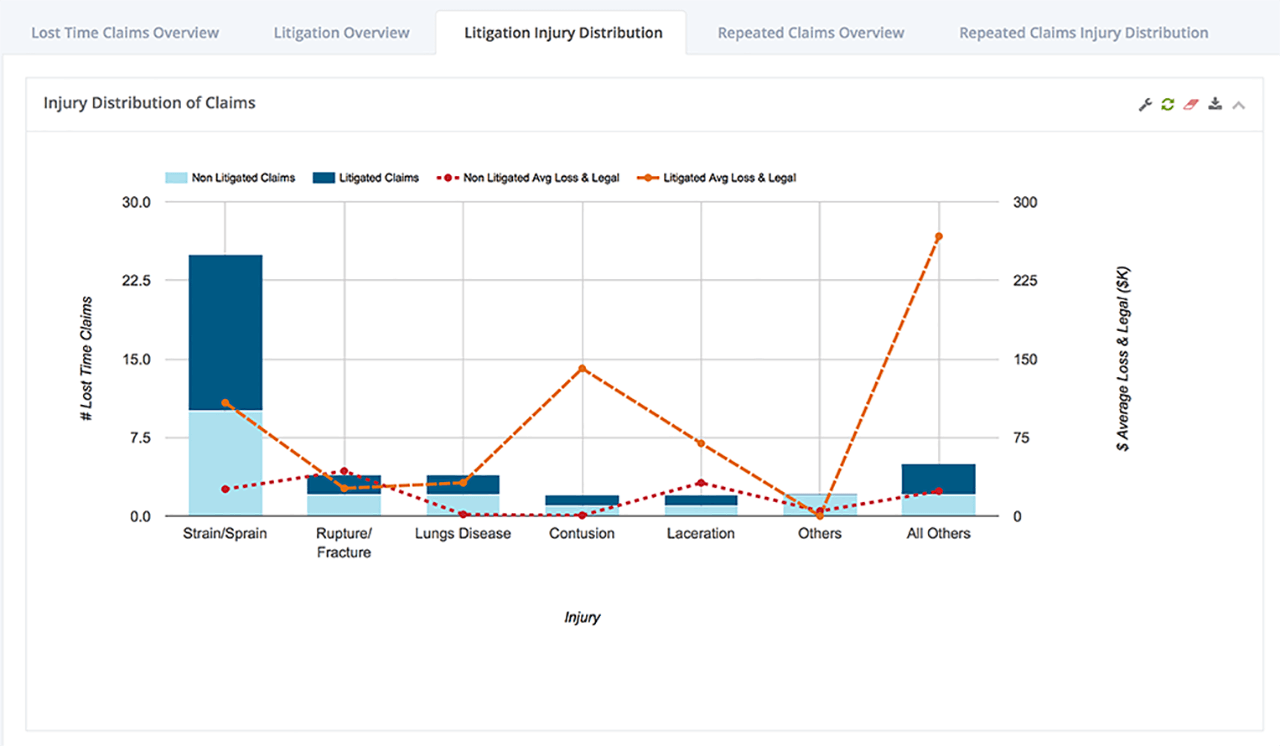
You are viewing the same dataset by injury, except that on the left you are filtering by the top 5 claims count, whereas on the right you are seeing the top 5 avg. loss. The Y-Axis is also flipped, so the application is not keeping a mental model as to where things are for the users. On top of that remember how I mentioned certain charts are clickable. This is one such case. If you click you would be taken to a breakdown of the causes for that specific injury.
Another opportunity to provide a more visual way to browse was to bring a human model and contextualize the injuries to body parts for an easier read.
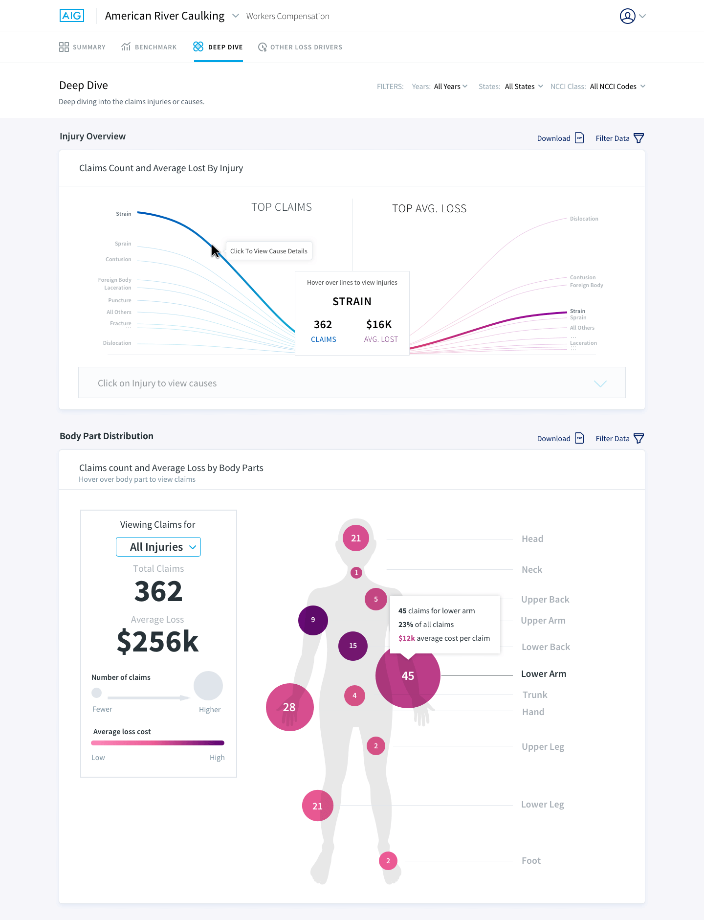
For the injury overview portion it is now more clear that you are viewing the top claims count on the left and the top average loss on the right. When you highlight a particular injury, the string highlights its average loss on the right and vice versa. The information is also displayed in the middle box. This data visualization allows for users to see all injuries and their values, which was something you could not do previously. You are also prompted as you hover on the greyed out box to click in order to view the causes for that injury.
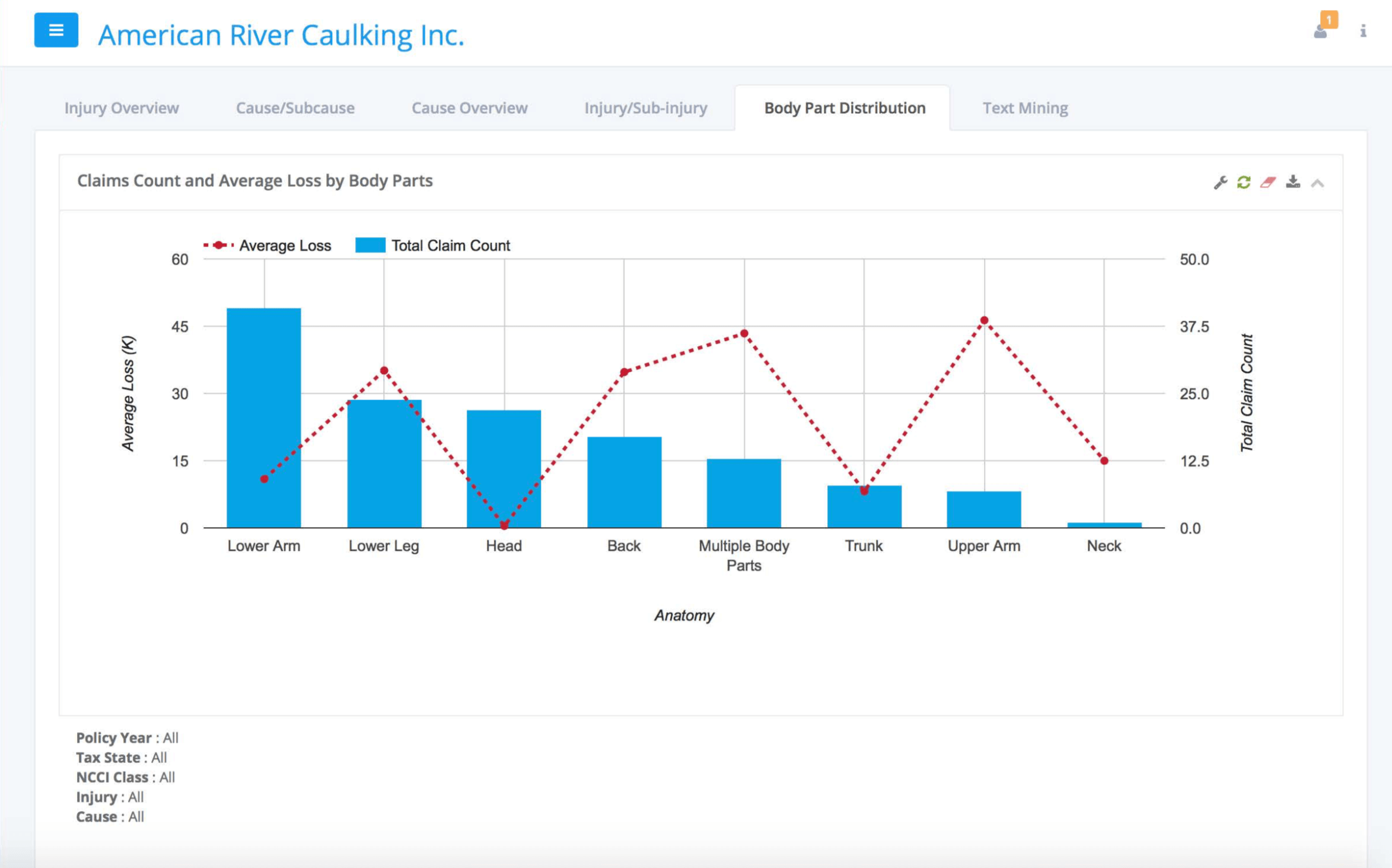
For the body part chart I used a mix of sizes to showcase the intensity of claims and color, to showcase the intensity of the average loss for that body part.
The project was a success! The client loved the stringed visualization. AIG is planning on selling this tool their clients, helping them deep dive into claims and associated costs.