

Designing a smartwatch that brings personality.
Year: March 2018|Roles: Research, Visual, Branding |Read Time: 3 mins
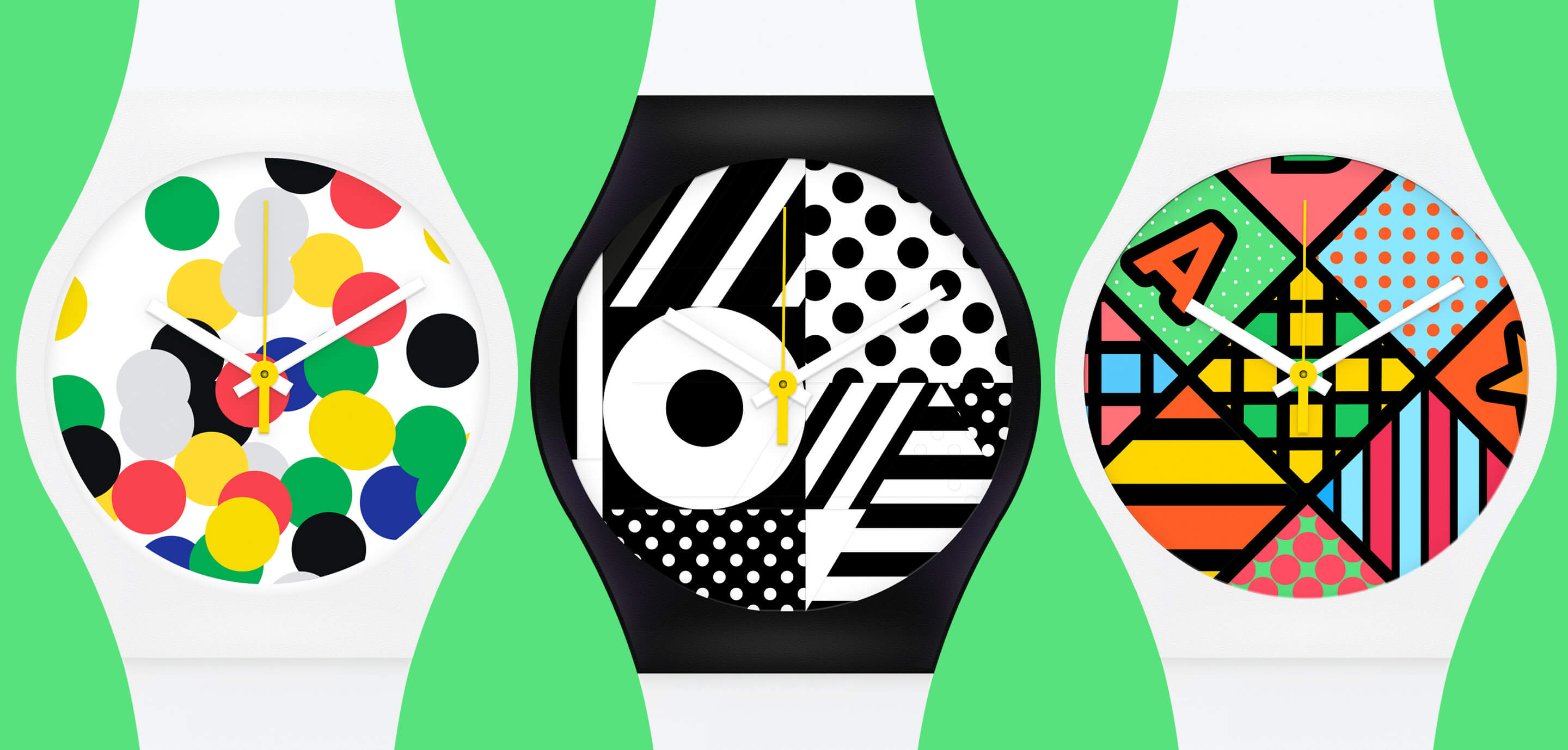
The iconic Swiss watchmaker Swatch, asked us to help them create a vision for the future of their watches. The goal was for us to understand the role of wearable devices in relation to self-expression in the lives of the target customers. We had to find a unique Swatch angle that tied back to its brand roots of bringing colorful art to people’s wrists at an affordable price point.
My tasks were to assist with gathering insights, facilitate workshops, and help define the concept vision by creating a refreshing new visual identity.
The project consisted of two phases: Insights Discovery and Concept Vision.
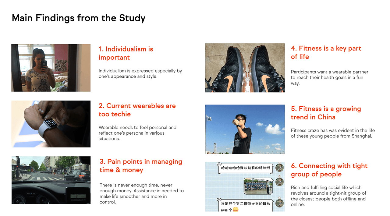
The Discovery phase consisted of a qualitative research in three target markets (USA, China, and France). In the Concept Vision phase, we created concepts based on the user needs, the brand, and business opportunities.
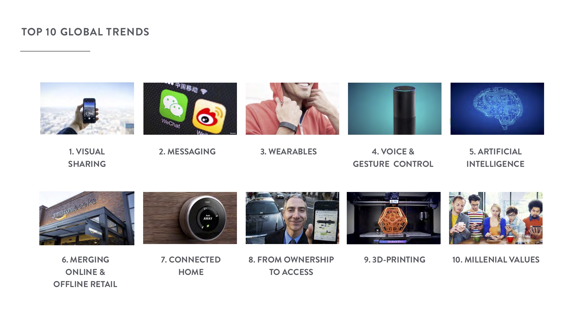
We started off with conducting a desk study on the most relevant trends to understand the landscape and identify opportunities for Swatch.
We then engaged in stakeholder interviews and came up with three methods to gather information from the target audience:
Ideation for the vision definition phase started based on the key findings of the study posed as "How might we..." questions.
We narrowed down the concepts based on three levels of analysis: how well they serve user needs, the business potential, and how well they would fit within the Swatch brand.
We also combined and further developed the concepts in and between these workshops. In the final presentation we ended with four promising concepts, two of which I was directly involved with defining.
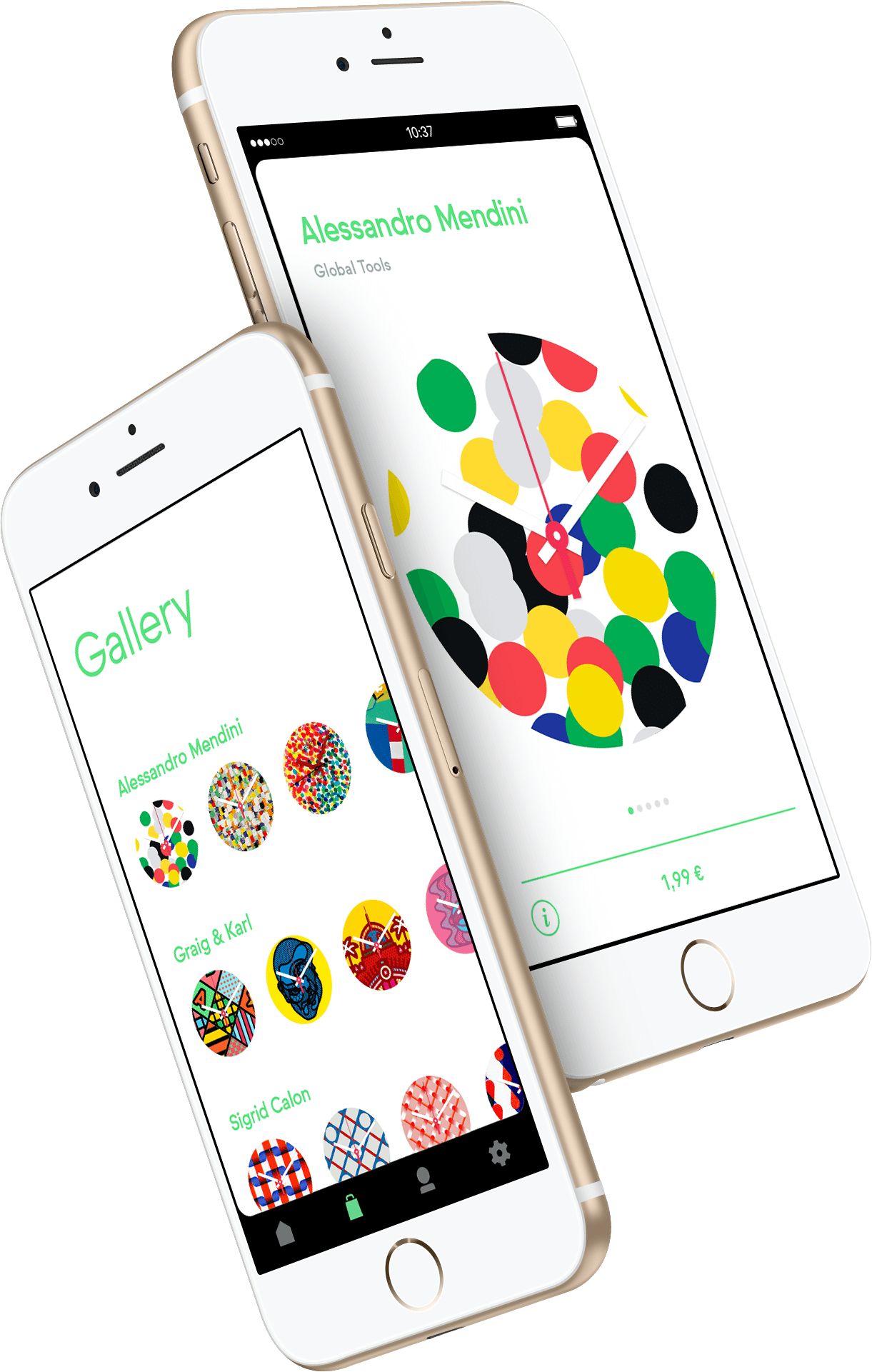
Zest is a watch that creates a platform for evolving digital art. I initially toyed with the idea of dynamic art, revealing itself on a white canvas based on the user’s activity during the day. The more you move, the more vibrant and colorful the designs become. The challenge was the sourcing of art and how we could create a sizable amount of patterns with the limited scope.
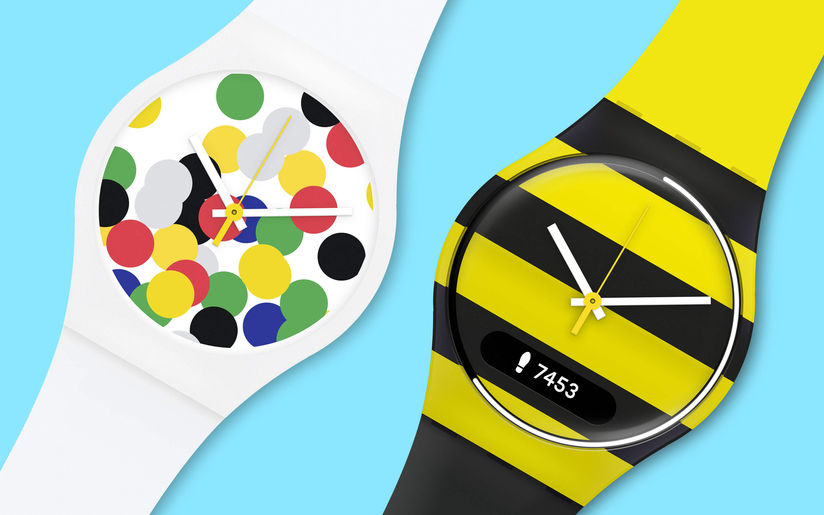
The Zest watch was envisioned to combine mechanical watch hands, seamless white display with bright colors, 7-day battery life, notifications, and activity tracking.
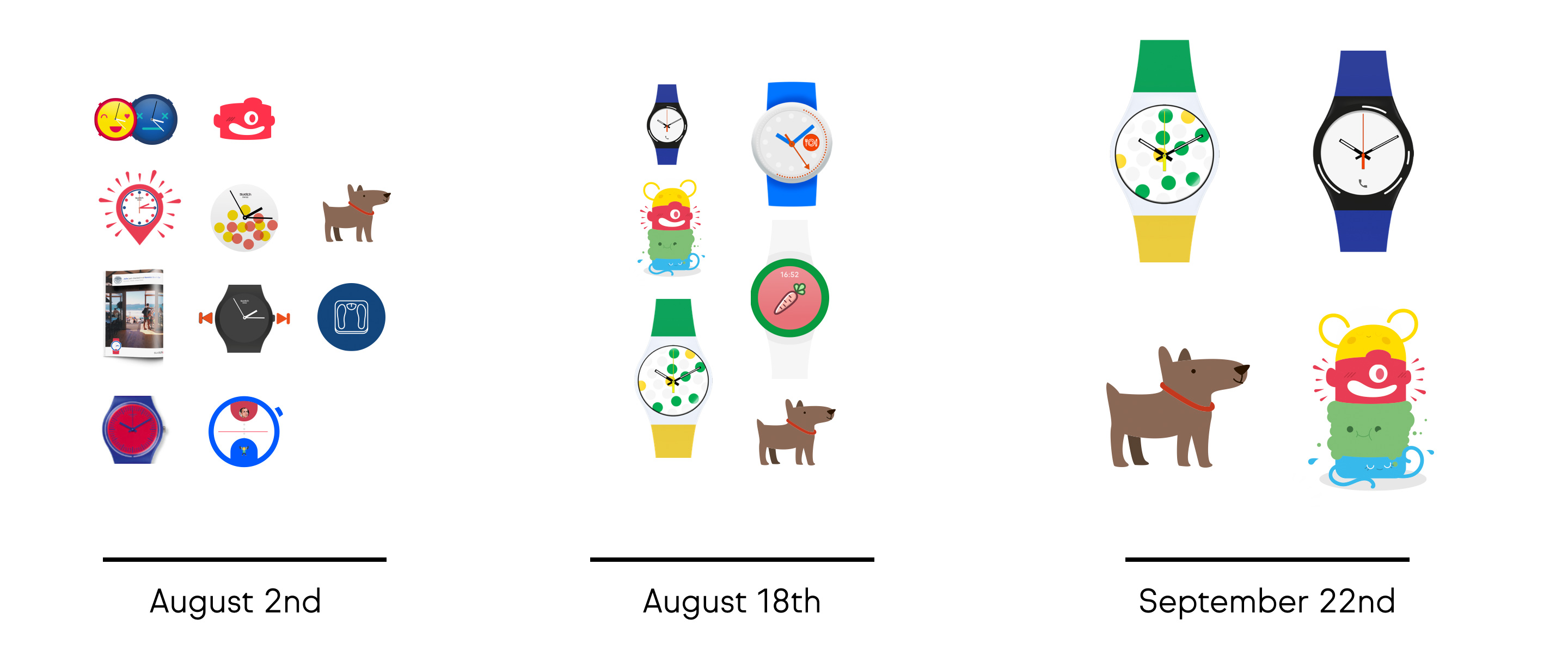
Habit Monsters is a concept that plays on building good habits, transforming your well-being into a character. It is based on the Tamagotchi idea where user activity and nutrition data is treated as a nourishable creature. This idea was more tailored to the Chinese markets, where gamification and attributing a character to a product was a major trend, and what many Chinese target users had come to expect based on research findings.

There are many characters to choose from depending on which habit you were tracking. For instance, the yellow character was tracking how much sun you get, red was how much focus you had on a particular task, green was tracking how many times you washed your hands or brushed your teeth, and blue was your daily water intake.
The concepts were presented to the Creative Director of Swatch. He was extremely excited about the concepts and is currently pushing for all of them to be developed.